OpenCV - Read, Write and Edit Videos

wordcloud

Capture video from a webcam

OpenCV provides a VideoCapture class that allows us to open a video file or a capturing device (like a webcam) or an IP video stream for video capturing. The first argument is either an index or a filename. index is the id of the video capturing device. index 0 opens default camera with default backend. In most notebook computers, webcam is the default camera. So we will use 0 as the index. If your webcam is camera 2, then you need to use index 1.

VideoCapture.read() function grabs video frames and returns a tuple. The first value in the tuple is a boolean value - True if a frame is grabbed and False if no frames are grabbed. Let's call it frameFlag. The second value (called frame here) returns an image of a video frame.

We will use an infinite while loop to capture video frames continously from a webcam and display them using imshow(), which we used to display images here. We will break the while loop using a keyboard key 'x'. You can use any key of your choice.

In [1]:
# Importing OpenCV library
import cv2
In [2]:
video=cv2.VideoCapture(0) # specify device id 0 for default camera (webcam)
while True:
    frameFlag,frame=video.read() # capture each video frame
    print(frameFlag, end=" ") # check if each frame is successfully captured
    cv2.imshow("Frames",frame) # dislay each video frame
    if cv2.waitKey(1)&0xFF==ord("x"): # Press 'x' to quit
        break
video.release() # Release VideoCapture object (webcam device)
cv2.destroyAllWindows() # close all display windows
True True True True True True True True True True True True True True True True True True True True True True True True True True True True True True True True True True True True True True True True True True True True True 

The output is a window of continous video frames captured from a webcam until the x key is pressed. The print output shows the boolean values of the first element of the VideoCapture.read() tuple. It appears that all frames were successfully read without failure.

[^top]

Capture video from a webcam in grayscale

We already used COLOR_BGR2RBG to convert BGR image array to RBG to display in PIL here. Now we will use COLOR_BGR2GRAY to convert each video frame to grayscale.

In [3]:
video=cv2.VideoCapture(0) # specify device id 0 for default camera (webcam)
while True:
    frameFlag,frame=video.read() # capture each video frame
    print(frameFlag, end=" ") # check if each frame is successfully captured
    grayframe=cv2.cvtColor(frame,cv2.COLOR_BGR2GRAY)
    cv2.imshow("Gray frames",grayframe) # dislay each video frame
    if cv2.waitKey(1)&0xFF==ord("x"): # Press 'x' to quit
        break
video.release() # Release VideoCapture object (webcam device)
cv2.destroyAllWindows() # close all display windows
True True True True True True True True True True True True True True True True True True True True True True True True True True True True True True True True True True True True True True True True True True True True True True True True True True True 

The output is a display of continous grayscale video frames.

[^top]

Capture video from a file

As mentioned earlier, VideoCapture class also accepts filename as an argument to read video files.

In [4]:
video=cv2.VideoCapture("https://go.allika.eu.org/catslomo") # specify the filename (path or URL)
while True:
    frameFlag,frame=video.read() # capture each video frame
    print(frameFlag, end=" ") # check if each frame is successfully captured
    if frameFlag: # display video frames till end of the video. frameFlag becomes False after the video ends.
        cv2.imshow("Frames",frame) # dislay each video frame
        cv2.waitKey(1)
    else:
        break  
video.release() # Release VideoCapture object (webcam device)
cv2.destroyAllWindows() # close all display windows
True True True True True True True True True True True True True True True True True True True True True True True True True True True True True True True True True True True True True True True True True True True True True True True True True True True True True True True True True True True True True True True True True True True True True True True True True True True True True True True True True True True True True True True True True True True True True True True True True True True True True True True True True True True True True True True True True True True True True True True True True True True True True True True True True True True True True True True True True True True True True True True True True True True True True True True True True True True True True True True True True True True True True True True True True True True True True True True True True True True True True True True True True True True True True True True True True True True True True True True True True True True True True True True True True True True True True True True True True True True True True True True True True True True True False 

Following is the video output of the code above. As the video ends, the frameFlag becomes False and the while loop breaks.

[^top]

Edit a video and write to a file

We will perform the following operations.

  • Read a video file or a webcam
  • Speed up the video playrate by 2x.
  • Convert it in to grayscale
  • Write it to a file.

OpenCV's VideoCapture class provides the following functions that we will use:

  • isOpened(): Returns true if video capturing has been initialized already. This is to check that the video is opened properly before editing.
  • get() to obtain following VideoCapture properties that we will use for editing and writing the video. The values retuned are of data type float, so they are converted to int.
    • Frame width: CAP_PROP_FRAME_WIDTH
    • Frame height: CAP_PROP_FRAME_HEIGHT
    • Frame rate (Frame per second, FPS): CAP_PROP_FPS

VideoWriter class is used for writing a video to a file. It accepts the following arguments:

  • filename: Output file name or path.
  • fourcc: FOURCC video codec. We use X246 codec as it produces comparitively smaller file sizes.
  • fps: Frame rate
  • size: video size (width x height)
  • isColor: Boolean value. If it is not zero, the encoder will expect and encode color frames, otherwise it will work with grayscale frames (the flag is currently supported on Windows only)
In [5]:
# Reading the input file.
input_video=cv2.VideoCapture("https://go.allika.eu.org/catslomo") # specify the filename (path or URL)
# input_video=cv2.VideoCapture(0) # Uncomment this line to capture from a webcam.

if input_video.isOpened(): # Ensure video is opened before editing
    # Get input video properties
    width=int(input_video.get(cv2.CAP_PROP_FRAME_WIDTH))
    height=int(input_video.get(cv2.CAP_PROP_FRAME_HEIGHT))
    fps=int(input_video.get(cv2.CAP_PROP_FPS))
    print("Video size: {}x{} pixels\nFrame rate: {} FPS".format(width,height,fps))
    # Defining output object
    output_video=cv2.VideoWriter("../../files/ml/002/cat_slomo_gray.mp4", # Output file
                                cv2.VideoWriter_fourcc(*'X264'), # FOURCC codec
                                2*fps, # To speed up the video by 2x, we multply FPS by 2
                                (width,height)) # video size
    while True:
        frameFlag,frame=input_video.read() # reading input
        if frameFlag:
            gray_frame=cv2.cvtColor(frame,cv2.COLOR_BGR2GRAY) # converting to grayscale
            # write frame to output
            output_video.write(gray_frame)
            # display output frame
            cv2.imshow("Frames",gray_frame)
            # Press 'x' to stop capturing
            if cv2.waitKey(1)&0xFF==ord("x"):
                break
        else:
            break
    
input_video.release() # Release VideoCapture object (input file or webcam device)
output_video.release() # Release VideoWriter object (output file)
cv2.destroyAllWindows() # close all display windows
Video size: 480x270
Frame rate: 30FPS

Following is the output video. Its in grayscale and play 2x faster.

[^top]

Last updated 2020-12-16 16:39:09.290219 IST

OpenCV - Read, Write and Edit Images

wordcloud

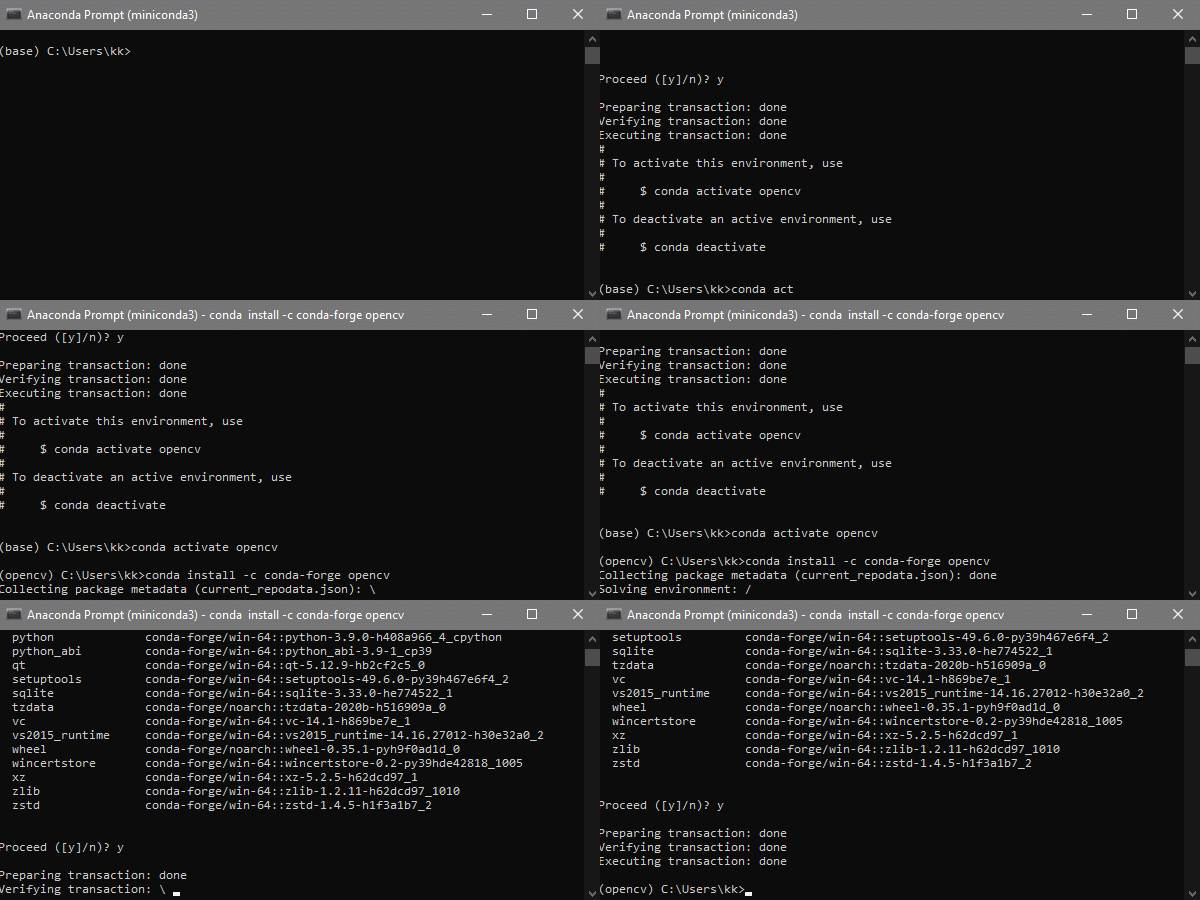
Installing OpenCV in Anaconda

It is advisable to create a new environment for every project. So create a new enviroment called "opencv" for example. Open Anaconda prompt and enter the following command.

conda create --name opencv

Activate the newly created environment "opencv".

conda activate opencv

Install OpenCV from conda-forge. conda-forge is the preferred channel to install OpenCV and not menpo anymore (menpo is outdated).

conda install -c conda-forge opencv

Installing OpenCV in Anaconda

Reading an image from a file to OpenCV

We will explore basic image reading and display options with OpenCV. More info at OpenCV docs.

In [1]:
# Importing libraries
import cv2 # OpenCV library
import numpy as np # NumPy
In [2]:
cv_img=cv2.imread("../../files/ml/001/cat_eye.jpg") # relative or absolute path to the image file
cv_img
Out[2]:
array([[[ 42,  73,  70],
        [ 45,  70,  72],
        [ 57,  76,  83],
        ...,
        [ 42,  56,  52],
        [ 43,  54,  51],
        [ 34,  47,  45]],

       [[ 47,  76,  80],
        [ 48,  72,  78],
        [ 71,  89,  96],
        ...,
        [ 37,  57,  52],
        [ 49,  63,  61],
        [ 51,  63,  63]],

       [[ 47,  77,  82],
        [ 51,  74,  82],
        [ 84, 101, 110],
        ...,
        [ 20,  42,  37],
        [ 32,  46,  44],
        [ 34,  46,  46]],

       ...,

       [[ 53,  94,  96],
        [ 44,  82,  86],
        [ 43,  81,  85],
        ...,
        [  1,  16,   8],
        [  0,  10,   6],
        [  4,  21,  17]],

       [[ 53,  91,  93],
        [ 67, 104, 108],
        [ 57,  93,  99],
        ...,
        [  0,   9,   0],
        [  3,  16,   8],
        [  0,  15,   7]],

       [[ 45,  78,  81],
        [ 67, 102, 106],
        [ 72, 108, 116],
        ...,
        [ 11,  19,  12],
        [  8,  19,   9],
        [  8,  22,  10]]], dtype=uint8)

The above output shows a numpy array of RGB values of the image.

Display the image with OpenCV

OpenCV has a imshow() to display an Image from an OpenCV array in a new window.

In [3]:
cv2.imshow("Image",cv_img)
cv2.waitKey(delay=5000) # Display image for 5 seconds
cv2.destroyAllWindows() # Close all image windows

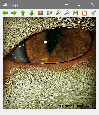
The image opens in a new window and looks like the following:

imshow() output

Closing the imshow() window using an ESCAPE key instead of a timer. The ASCII value of the ESC key is 27.

In [4]:
cv2.imshow("Image",cv_img)
if cv2.waitKey()==27:
    cv2.destroyAllWindows()

The image displayed in a seperate window until I pressed the ESC key.

Display using PIL

We need to convert the OpenCV image array to a PIL image. If PIL is not installed, you can install it by entering the following command in Anaconda prompt.

conda install pillow

OpenCV stores images in BGR format whereas image files store them in RGB format. We need to convert BGR to RGB first. If not, this is how the image file is written.

In [5]:
from PIL import Image
Image.fromarray(cv_img)
Out[5]:
No description has been provided for this image
In [6]:
# Converting BGR to RGB
img_array=cv2.cvtColor(cv_img,cv2.COLOR_BGR2RGB)
# Converting to PIL image
img=Image.fromarray(img_array)
img
Out[6]:
No description has been provided for this image
Display using matplotlib

If not already installed, Matplotlib can be installed by typing the following command in Anaconda prompt.

conda install matplotlib

In [7]:
from matplotlib import pyplot as plt
In [8]:
#Show the image with matplotlib
plt.imshow(cv2.cvtColor(cv_img, cv2.COLOR_BGR2RGB)) # convert from BGR to RGB before plotting
plt.show()
No description has been provided for this image
Reading in grayscale
In [9]:
cv_img=cv2.imread("../../files/ml/001/cat_eye.jpg",0) # the second argument '0' is for grayscale
cv_img
Out[9]:
array([[ 69,  68,  76, ...,  53,  52,  45],
       [ 74,  71,  89, ...,  53,  61,  62],
       [ 75,  74, 102, ...,  38,  44,  45],
       ...,
       [ 90,  79,  78, ...,  12,   7,  18],
       [ 87, 101,  91, ...,   5,  12,  11],
       [ 75,  99, 106, ...,  16,  15,  17]], dtype=uint8)
In [10]:
plt.imshow(cv2.cvtColor(cv_img, cv2.COLOR_BGR2RGB)) # convert from BGR to RGB before plotting
plt.show()
No description has been provided for this image

[^top]

Reading in reduced grayscale
In [11]:
cv_img=cv2.imread("../../files/ml/001/cat_eye.jpg",64) # the second argument '64' is for reduced grayscale 8
cv_img
Out[11]:
array([[ 70,  78,  91, ...,  37,  39,  36],
       [ 74,  90, 108, ...,  54,  39,  26],
       [ 89, 104, 125, ...,  57,  40,  32],
       ...,
       [113, 118, 134, ...,  52,  44,  34],
       [104, 111, 127, ...,  63,  46,  36],
       [104, 104, 109, ...,  32,  25,  20]], dtype=uint8)
In [12]:
plt.imshow(cv2.cvtColor(cv_img, cv2.COLOR_BGR2RGB)) # convert from BGR to RGB before plotting
plt.show()
No description has been provided for this image

[^top]

Reading in reduced colour
In [13]:
cv_img=cv2.imread("../../files/ml/001/cat_eye.jpg",65) # the second argument '65' is for reduced colour 8
cv_img
Out[13]:
array([[[ 47,  71,  77],
        [ 46,  81,  85],
        [ 59,  94,  98],
        ...,
        [ 23,  38,  41],
        [ 23,  40,  43],
        [ 25,  38,  36]],

       [[ 46,  75,  82],
        [ 56,  92, 100],
        [ 71, 110, 118],
        ...,
        [ 35,  54,  62],
        [ 23,  39,  45],
        [ 12,  28,  27]],

       [[ 59,  91,  97],
        [ 70, 106, 112],
        [ 86, 128, 133],
        ...,
        [ 34,  57,  65],
        [ 24,  40,  46],
        [ 16,  33,  36]],

       ...,

       [[ 81, 116, 120],
        [ 84, 121, 125],
        [100, 137, 141],
        ...,
        [ 33,  56,  52],
        [ 25,  48,  44],
        [ 18,  37,  34]],

       [[ 72, 107, 111],
        [ 74, 115, 118],
        [ 92, 130, 135],
        ...,
        [ 42,  66,  66],
        [ 28,  49,  46],
        [ 20,  40,  35]],

       [[ 70, 107, 111],
        [ 69, 107, 111],
        [ 74, 111, 119],
        ...,
        [ 16,  34,  33],
        [ 11,  28,  25],
        [  9,  24,  16]]], dtype=uint8)
In [14]:
plt.imshow(cv2.cvtColor(cv_img, cv2.COLOR_BGR2RGB)) # convert from BGR to RGB before plotting
plt.show()
No description has been provided for this image

[^top]

Writing an image to a file with OpenCV

cv2.imwrite() takes the arguments file path and OpenCV image array.

In [15]:
cv_img=cv2.imread("../../files/ml/001/cat_eye.jpg") # reading an image from a file
cv2.imwrite("../../files/ml/001/cat_eye_new.jpg",cv_img) # writing an image to a file
Out[15]:
True
In [16]:
Image.open("../../files/ml/cat_eye_new.jpg")
Out[16]:
No description has been provided for this image

Both images look the same but they are not the same as you notice below. Why?

In [17]:
cv_img_new=cv2.imread("../../files/ml/001/cat_eye_new.jpg")
np.array_equal(cv_img,cv_img_new)
Out[17]:
False

[^top]

Reading an image from a URL to OpenCV

We are going to attempt to read an image directly from a URL in to OpenCV. It is possible to download the images manually in to a local drive and then read them with the cv2.imread() method, but at times we will need to read files directly from a URL.

Here is a link to an image of my cat's eye that we are going to access: https://go.allika.eu.org/cateye

NumPy and OpenCV are required, so they are imported.

In [18]:
# Importing libraries
import cv2
import numpy as np 

# Image URL
url="https://go.allika.eu.org/cateye"

There is more than one way to read images to OpenCV from URLs. We explore a few.

1. Using urllib3

In [19]:
# Importing libraries
import urllib.request as urlRequest 

Specify header type

In [20]:
url_request = urlRequest.Request(url, headers={'User-Agent': 'Mozilla/5.0'})

Get URL response.

In [21]:
url_response=urlRequest.urlopen(url_request).read()

Convert URL data in to a NumPy array

In [22]:
img_array = np.array(bytearray(url_response), dtype=np.uint8)

Read the array in to OpenCV

In [23]:
cv_img = cv2.imdecode(img_array, -1)

View image in OpenCV

In [24]:
cv_img
Out[24]:
array([[[ 42,  73,  70],
        [ 45,  70,  72],
        [ 57,  76,  83],
        ...,
        [ 42,  56,  52],
        [ 43,  54,  51],
        [ 34,  47,  45]],

       [[ 47,  76,  80],
        [ 48,  72,  78],
        [ 71,  89,  96],
        ...,
        [ 37,  57,  52],
        [ 49,  63,  61],
        [ 51,  63,  63]],

       [[ 47,  77,  82],
        [ 51,  74,  82],
        [ 84, 101, 110],
        ...,
        [ 20,  42,  37],
        [ 32,  46,  44],
        [ 34,  46,  46]],

       ...,

       [[ 53,  94,  96],
        [ 44,  82,  86],
        [ 43,  81,  85],
        ...,
        [  1,  16,   8],
        [  0,  10,   6],
        [  4,  21,  17]],

       [[ 53,  91,  93],
        [ 67, 104, 108],
        [ 57,  93,  99],
        ...,
        [  0,   9,   0],
        [  3,  16,   8],
        [  0,  15,   7]],

       [[ 45,  78,  81],
        [ 67, 102, 106],
        [ 72, 108, 116],
        ...,
        [ 11,  19,  12],
        [  8,  19,   9],
        [  8,  22,  10]]], dtype=uint8)

[^top]

2. Using urllib3 and PIL

In [25]:
# Importing libraries
import urllib.request as urlRequest 
from PIL import Image

Specify header type

In [26]:
url_request = urlRequest.Request(url, headers={'User-Agent': 'Mozilla/5.0'})

The image is read directly from the URL in to a PIL image.

In [27]:
img = Image.open(urlRequest.urlopen(url_request))

Since this is a PIL image, we can view the image here. Let's make sure we have the correct image.

In [28]:
img
Out[28]:
No description has been provided for this image

We can view the RGB values of an image by converting it to a NumPy array

In [29]:
np.asarray(img)
Out[29]:
array([[[ 70,  73,  42],
        [ 72,  70,  45],
        [ 83,  76,  57],
        ...,
        [ 52,  56,  42],
        [ 51,  54,  43],
        [ 45,  47,  34]],

       [[ 80,  76,  47],
        [ 78,  72,  48],
        [ 96,  89,  71],
        ...,
        [ 52,  57,  37],
        [ 61,  63,  49],
        [ 63,  63,  51]],

       [[ 82,  77,  47],
        [ 82,  74,  51],
        [110, 101,  84],
        ...,
        [ 37,  42,  20],
        [ 44,  46,  32],
        [ 46,  46,  34]],

       ...,

       [[ 96,  94,  53],
        [ 86,  82,  44],
        [ 85,  81,  43],
        ...,
        [  8,  16,   1],
        [  6,  10,   0],
        [ 17,  21,   4]],

       [[ 93,  91,  53],
        [108, 104,  67],
        [ 99,  93,  57],
        ...,
        [  0,   9,   0],
        [  8,  16,   3],
        [  7,  15,   0]],

       [[ 81,  78,  45],
        [106, 102,  67],
        [116, 108,  72],
        ...,
        [ 12,  19,  11],
        [  9,  19,   8],
        [ 10,  22,   8]]], dtype=uint8)

However, OpenCV uses BGR format instead of RGB format. We need to specify the color code when we convert the image to OpenCV format.

In [30]:
cv_img=cv2.cvtColor(np.array(img), cv2.COLOR_RGB2BGR)

View image in OpenCV

In [31]:
cv_img
Out[31]:
array([[[ 42,  73,  70],
        [ 45,  70,  72],
        [ 57,  76,  83],
        ...,
        [ 42,  56,  52],
        [ 43,  54,  51],
        [ 34,  47,  45]],

       [[ 47,  76,  80],
        [ 48,  72,  78],
        [ 71,  89,  96],
        ...,
        [ 37,  57,  52],
        [ 49,  63,  61],
        [ 51,  63,  63]],

       [[ 47,  77,  82],
        [ 51,  74,  82],
        [ 84, 101, 110],
        ...,
        [ 20,  42,  37],
        [ 32,  46,  44],
        [ 34,  46,  46]],

       ...,

       [[ 53,  94,  96],
        [ 44,  82,  86],
        [ 43,  81,  85],
        ...,
        [  1,  16,   8],
        [  0,  10,   6],
        [  4,  21,  17]],

       [[ 53,  91,  93],
        [ 67, 104, 108],
        [ 57,  93,  99],
        ...,
        [  0,   9,   0],
        [  3,  16,   8],
        [  0,  15,   7]],

       [[ 45,  78,  81],
        [ 67, 102, 106],
        [ 72, 108, 116],
        ...,
        [ 11,  19,  12],
        [  8,  19,   9],
        [  8,  22,  10]]], dtype=uint8)

We can see the difference between the NumPy array output of the image and the OpenCV output. The RGB values are reversed.

[^top]

3. Using PIL, requests and BytesIO

In [32]:
# Importing libraries
from PIL import Image
import requests
from io import BytesIO

Read data from URL

In [33]:
response = requests.get(url)

Read URL response in to a PIL image using BytesIO

In [34]:
img = Image.open(BytesIO(response.content))

Let's view the image.

In [35]:
img
Out[35]:
No description has been provided for this image

Rest is same as the method 2. Images have pixels in RGB format but OpenCV uses BGR. We need to specify the color code when we convert the image to OpenCV format.

In [36]:
cv_img=cv2.cvtColor(np.array(img), cv2.COLOR_RGB2BGR)
cv_img
Out[36]:
array([[[ 42,  73,  70],
        [ 45,  70,  72],
        [ 57,  76,  83],
        ...,
        [ 42,  56,  52],
        [ 43,  54,  51],
        [ 34,  47,  45]],

       [[ 47,  76,  80],
        [ 48,  72,  78],
        [ 71,  89,  96],
        ...,
        [ 37,  57,  52],
        [ 49,  63,  61],
        [ 51,  63,  63]],

       [[ 47,  77,  82],
        [ 51,  74,  82],
        [ 84, 101, 110],
        ...,
        [ 20,  42,  37],
        [ 32,  46,  44],
        [ 34,  46,  46]],

       ...,

       [[ 53,  94,  96],
        [ 44,  82,  86],
        [ 43,  81,  85],
        ...,
        [  1,  16,   8],
        [  0,  10,   6],
        [  4,  21,  17]],

       [[ 53,  91,  93],
        [ 67, 104, 108],
        [ 57,  93,  99],
        ...,
        [  0,   9,   0],
        [  3,  16,   8],
        [  0,  15,   7]],

       [[ 45,  78,  81],
        [ 67, 102, 106],
        [ 72, 108, 116],
        ...,
        [ 11,  19,  12],
        [  8,  19,   9],
        [  8,  22,  10]]], dtype=uint8)

[^top]

Last updated 2020-12-16 16:37:03.467510 IST

Python Installation

wordcloud

Introduction to Python

Currently, Python is the most popular programming language used in Data Science. It is a high-level programming language that uses an interpreter to run programs.

If you are interested in learning Python, there are numerous free resources available online. Following are my top recommendations:

  1. Runestone interactive sessions on Foundations of Python Programming followed by Python for Everybody
  2. University of Michigan's Python 3 programming. Apply for financial aid and they usually approve it.
  3. Youtube Python full course from freecodecam.org
  4. Youtube Python tutorial from Mosh
  5. SoloLearn is a fun way to learn basics on Python if you want to learn Python on your mobile phone.

You can also learn from Python.org and W3Schools

Bonus links

  1. Python tutorial in Telugu
  2. Python tutorial in Hindi

Note: There are free Python courses from IBM and Microsoft as well, but I suggest to avoid them if your goal is to learn Python as the amount of learning you gain from them is minimal and their main focus is on selling their products (IBM Watson and Microsoft Azure). These courses appears as if they were designed by their sales/marketing teams to give out easy certificates. However, if getting a quick certificate if your goal then go for them.

Installation

Python can be installed directly from Python.org or by installing an Anaconda Python package. Installation may vary depending on your operating system and there's a lot of help available online regarding installation. Here I am going to mention briefly the steps I took to install Anaconda/Miniconda Python on my Windows 10 system.

Installing Anaconda

Anaconda is a Python distribution platform that comes with many data science related libraries by default. The Individual version is free and can be downloaded from here. Installation is straight forward. Anaconda provides a Python IDE called Spyder and GUI with options to install/open Jupyter Lab and other tools. Sypder is one of the best free Python IDEs, probably only next to PyCharm. If you are a beginner to programming or have used other IDEs like Eclipse, you might like using Spyder.

Installing Miniconda

Miniconda is a bare bones version of Anaconda that includes only conda, Python and a small number of packages. This is my favourite Python distribution as it is light weight and allows me to add packages when I need them. It also does not come with a GUI (navigation panel) which I never found of much use. It also does not come with Spyder (a Python IDE) that I don't use as I prefer working on JupyterLabs instead.

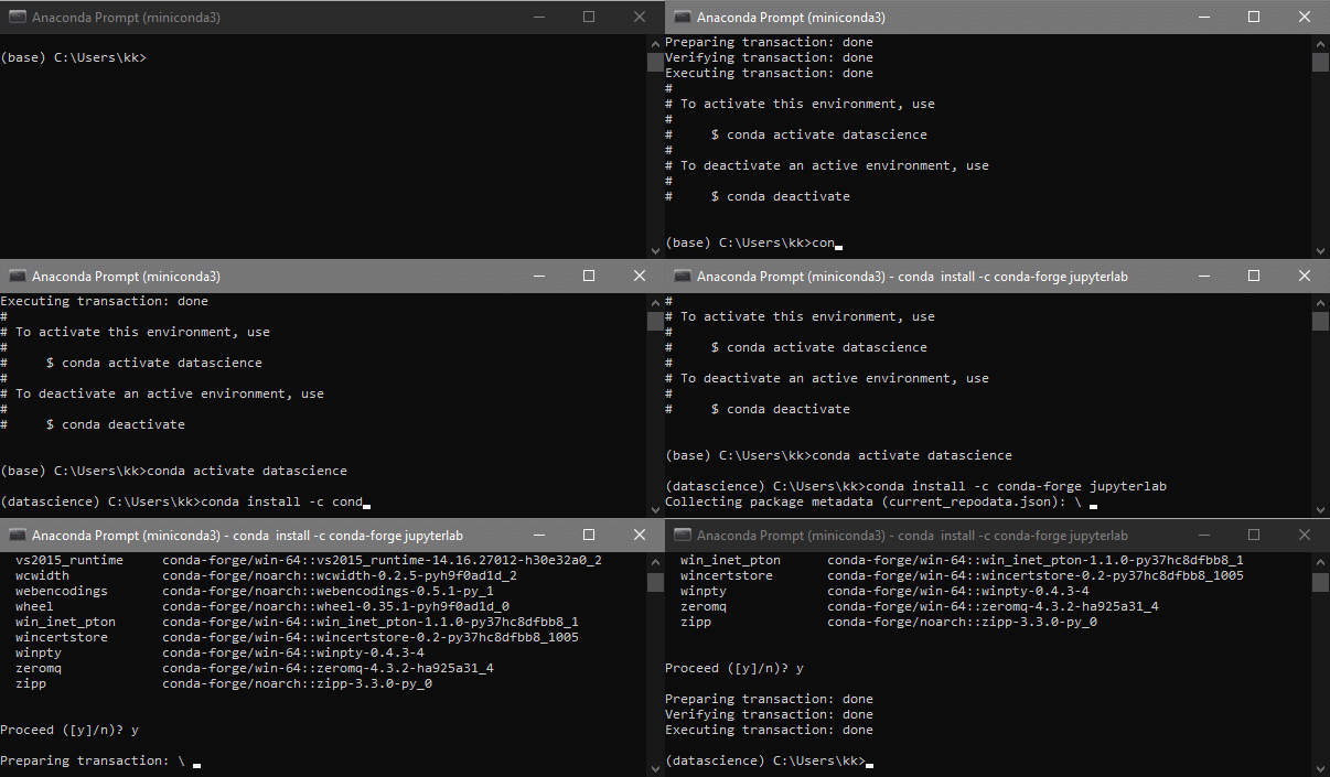
Installing JupyterLab

JupyterLab enables us to combine Python code and documentation in the same file, which makes it ideal for writing data science programs.

Installation steps:

  1. Open Anaconda prompt and create a new environment using the following command. Let's create an environment named "datascience".

conda create --name datascience

  1. Activate the newly created environment.

    conda activate datascience

  2. Install JupyterLab.

    conda install -c conda-forge jupyterlab

  3. Open JupyterLab

    jupyter lab

No description has been provided for this image

Last updated 2020-10-15 17:38:42.961631 IST

Statistical Inference - Introduction

R version 4.0.0 (2020-04-24) -- "Arbor Day"
Copyright (C) 2020 The R Foundation for Statistical Computing
Platform: x86_64-w64-mingw32/x64 (64-bit)

R is free software and comes with ABSOLUTELY NO WARRANTY.
You are welcome to redistribute it under certain conditions.
Type 'license()' or 'licence()' for distribution details.

Natural language support but running in an English locale

R is a collaborative project with many contributors.
Type 'contributors()' for more information and
'citation()' on how to cite R or R packages in publications.

Type 'demo()' for some demos, 'help()' for on-line help, or
'help.start()' for an HTML browser interface to help.
Type 'q()' to quit R.

library(swirl)

| Hi! Type swirl() when you are ready to begin.

swirl()

| Welcome to swirl! Please sign in. If you've been here before, use the same name as
| you did then. If you are new, call yourself something unique.

What shall I call you? Krishnakanth Allika

| Please choose a course, or type 0 to exit swirl.

1: Exploratory Data Analysis
2: Statistical Inference
3: Take me to the swirl course repository!

Selection: 2

| Please choose a lesson, or type 0 to return to course menu.

 1: Introduction             2: Probability1             3: Probability2            
 4: ConditionalProbability   5: Expectations             6: Variance                
 7: CommonDistros            8: Asymptotics              9: T Confidence Intervals  
10: Hypothesis Testing      11: P Values                12: Power                   
13: Multiple Testing        14: Resampling                

Selection: 1

| | 0%

| Introduction to Statistical_Inference. (Slides for this and other Data Science
| courses may be found at github https://github.com/DataScienceSpecialization/courses.
| If you care to use them, they must be downloaded as a zip file and viewed locally.
| This lesson corresponds to Statistical_Inference/Introduction.)

...

|======== | 10%
| In this lesson, we'll briefly introduce basics of statistical inference, the process
| of drawing conclusions "about a population using noisy statistical data where
| uncertainty must be accounted for". In other words, statistical inference lets
| scientists formulate conclusions from data and quantify the uncertainty arising from
| using incomplete data.

...

|=============== | 20%
| Which of the following is NOT an example of statistical inference?

1: Polling before an election to predict its outcome
2: Recording the results of a statistics exam
3: Testing the efficacy of a new drug
4: Constructing a medical image from fMRI data

Selection: 2

| All that hard work is paying off!

|======================= | 30%
| So statistical inference involves formulating conclusions using data AND quantifying
| the uncertainty associated with those conclusions. The uncertainty could arise from
| incomplete or bad data.

...

|=============================== | 40%
| Which of the following would NOT be a source of bad data?

1: Small sample size
2: Selection bias
3: A randomly selected sample of population
4: A poorly designed study

Selection: 3

| Your dedication is inspiring!

|====================================== | 50%
| So with statistical inference we use data to draw general conclusions about a
| population. Which of the following would a scientist using statistical inference
| techniques consider a problem?

1: Our study has no bias and is well-designed
2: Our data sample is representative of the population
3: Contaminated data

Selection: 3

| That's a job well done!

|============================================== | 60%
| Which of the following is NOT an example of statistical inference in action?

1: Testing the effectiveness of a medical treatment
2: Estimating the proportion of people who will vote for a candidate
3: Determining a causative mechanism underlying a disease
4: Counting sheep

Selection: 4

| You got it right!

|====================================================== | 70%
| We want to emphasize a couple of important points here. First, a statistic
| (singular) is a number computed from a sample of data. We use statistics to infer
| information about a population. Second, a random variable is an outcome from an
| experiment. Deterministic processes, such as computing means or variances, applied
| to random variables, produce additional random variables which have their own
| distributions. It's important to keep straight which distributions you're talking
| about.

...

|============================================================== | 80%
| Finally, there are two broad flavors of inference. The first is frequency, which
| uses "long run proportion of times an event occurs in independent, identically
| distributed repetitions." The second is Bayesian in which the probability estimate
| for a hypothesis is updated as additional evidence is acquired. Both flavors require
| an understanding of probability so that's what the next lessons will cover.

...

|===================================================================== | 90%
| Congrats! You've concluded this brief introduction to statistical inference.

...

|=============================================================================| 100%
| Would you like to receive credit for completing this course on Coursera.org?

1: No
2: Yes

Selection: 2
What is your email address? xxxxxx@xxxxxxxxxxxx
What is your assignment token? xXxXxxXXxXxxXXXx
Grade submission succeeded!

| Great job!

| You've reached the end of this lesson! Returning to the main menu...

| Please choose a course, or type 0 to exit swirl.

1: Exploratory Data Analysis
2: Statistical Inference
3: Take me to the swirl course repository!

Selection: 0

| Leaving swirl now. Type swirl() to resume.

Last updated 2020-10-02 01:21:12.806232 IST

K Means Clustering

library(swirl)
swirl()

| Welcome to swirl! Please sign in. If you've been here before, use the same name as
| you did then. If you are new, call yourself something unique.

What shall I call you? Krishnakanth Allika

| Please choose a course, or type 0 to exit swirl.

1: Exploratory Data Analysis
2: Take me to the swirl course repository!

Selection: 1

| Please choose a lesson, or type 0 to return to course menu.

 1: Principles of Analytic Graphs   2: Exploratory Graphs             
 3: Graphics Devices in R           4: Plotting Systems               
 5: Base Plotting System            6: Lattice Plotting System        
 7: Working with Colors             8: GGPlot2 Part1                  
 9: GGPlot2 Part2                  10: GGPlot2 Extras                 
11: Hierarchical Clustering        12: K Means Clustering             
13: Dimension Reduction            14: Clustering Example             
15: CaseStudy                        

Selection: 12

| Attempting to load lesson dependencies...

| Package ‘ggplot2’ loaded correctly!

| Package ‘fields’ loaded correctly!

| Package ‘jpeg’ loaded correctly!

| Package ‘datasets’ loaded correctly!

| | 0%

| K_Means_Clustering. (Slides for this and other Data Science courses may be found at
| github https://github.com/DataScienceSpecialization/courses/. If you care to use
| them, they must be downloaded as a zip file and viewed locally. This lesson
| corresponds to 04_ExploratoryAnalysis/kmeansClustering.)

...

|== | 2%
| In this lesson we'll learn about k-means clustering, another simple way of examining
| and organizing multi-dimensional data. As with hierarchical clustering, this
| technique is most useful in the early stages of analysis when you're trying to get
| an understanding of the data, e.g., finding some pattern or relationship between
| different factors or variables.

...

|=== | 4%
| R documentation tells us that the k-means method "aims to partition the points into
| k groups such that the sum of squares from points to the assigned cluster centres is
| minimized."

...

|===== | 6%
| Since clustering organizes data points that are close into groups we'll assume we've
| decided on a measure of distance, e.g., Euclidean.

...

|====== | 8%
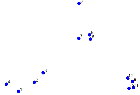
| To illustrate the method, we'll use these random points we generated, familiar to
| you if you've already gone through the hierarchical clustering lesson. We'll
| demonstrate k-means clustering in several steps, but first we'll explain the general
| idea.

image
...

|======== | 10%
| As we said, k-means is a partioning approach which requires that you first guess how
| many clusters you have (or want). Once you fix this number, you randomly create a
| "centroid" (a phantom point) for each cluster and assign each point or observation
| in your dataset to the centroid to which it is closest. Once each point is assigned
| a centroid, you readjust the centroid's position by making it the average of the
| points assigned to it.

...

|========= | 12%
| Once you have repositioned the centroids, you must recalculate the distance of the
| observations to the centroids and reassign any, if necessary, to the centroid
| closest to them. Again, once the reassignments are done, readjust the positions of
| the centroids based on the new cluster membership. The process stops once you reach
| an iteration in which no adjustments are made or when you've reached some
| predetermined maximum number of iterations.

...

|=========== | 14%
| As described, what does this process require?

1: All of the others
2: A number of clusters
3: A defined distance metric
4: An initial guess as to cluster centroids

Selection: 1

| That's the answer I was looking for.

|============ | 16%
| So k-means clustering requires some distance metric (say Euclidean), a hypothesized
| fixed number of clusters, and an initial guess as to cluster centroids. As
| described, what does this process produce?

1: All of the others
2: An assignment of each point to a cluster
3: A final estimate of cluster centroids

Selection: 1

| You nailed it! Good job!

|============== | 18%
| When it's finished k-means clustering returns a final position of each cluster's
| centroid as well as the assignment of each data point or observation to a cluster.

...

|=============== | 20%
| Now we'll step through this process using our random points as our data. The
| coordinates of these are stored in 2 vectors, x and y. We eyeball the display and
| guess that there are 3 clusters. We'll pick 3 positions of centroids, one for each
| cluster.

...

|================= | 22%
| We've created two 3-long vectors for you, cx and cy. These respectively hold the x-
| and y- coordinates for 3 proposed centroids. For convenience, we've also stored them
| in a 2 by 3 matrix cmat. The x coordinates are in the first row and the y
| coordinates in the second. Look at cmat now.

cmat

     [,1] [,2] [,3]  
[1,]    1  1.8  2.5  
[2,]    2  1.0  1.5  

| Excellent work!

|================== | 24%
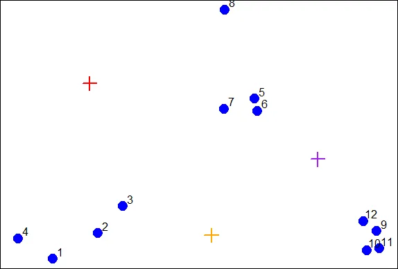
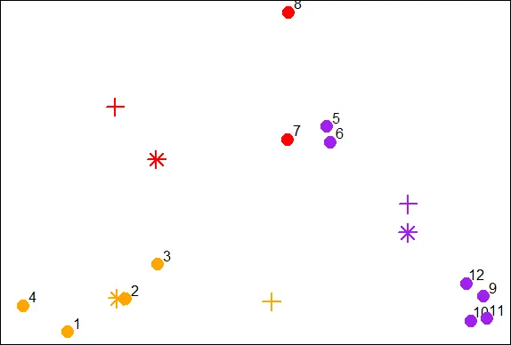
| The coordinates of these points are (1,2), (1.8,1) and (2.5,1.5). We'll add these
| centroids to the plot of our points. Do this by calling the R command points with 6
| arguments. The first 2 are cx and cy, and the third is col set equal to the
| concatenation of 3 colors, "red", "orange", and "purple". The fourth argument is pch
| set equal to 3 (a plus sign), the fifth is cex set equal to 2 (expansion of
| character), and the final is lwd (line width) also set equal to 2.

points(cx,cy,col=c("red","orange","purple"),pch=3,cex=2,lwd=2)

image

| You nailed it! Good job!

|==================== | 26%
| We see the first centroid (1,2) is in red. The second (1.8,1), to the right and
| below the first, is orange, and the final centroid (2.5,1.5), the furthest to the
| right, is purple.

...

|====================== | 28%
| Now we have to calculate distances between each point and every centroid. There are
| 12 data points and 3 centroids. How many distances do we have to calculate?

1: 15
2: 108
3: 36
4: 9

Selection: 3

| You are amazing!

|======================= | 30%
| We've written a function for you called mdist which takes 4 arguments. The vectors
| of data points (x and y) are the first two and the two vectors of centroid
| coordinates (cx and cy) are the last two. Call mdist now with these arguments.

mdist(x,y,cx,cy)

         [,1]      [,2]      [,3]     [,4]      [,5]      [,6]      [,7]     [,8]  
[1,] 1.392885 0.9774614 0.7000680 1.264693 1.1894610 1.2458771 0.8113513 1.026750  
[2,] 1.108644 0.5544675 0.3768445 1.611202 0.8877373 0.7594611 0.7003994 2.208006  
[3,] 3.461873 2.3238956 1.7413021 4.150054 0.3297843 0.2600045 0.4887610 1.337896  
          [,9]     [,10]     [,11]     [,12]  
[1,] 4.5082665 4.5255617 4.8113368 4.0657750  
[2,] 1.1825265 1.0540994 1.2278193 1.0090944  
[3,] 0.3737554 0.4614472 0.5095428 0.2567247  

| Excellent job!

|========================= | 32%
| We've stored these distances in the matrix distTmp for you. Now we have to assign a
| cluster to each point. To do that we'll look at each column and ?

1: add up the 3 entries.
2: pick the minimum entry
3: pick the maximum entry

Selection: 2

| Perseverance, that's the answer.

|========================== | 34%
| From the distTmp entries, which cluster would point 6 be assigned to?

1: none of the above
2: 3
3: 2
4: 1

Selection: 2

| Keep working like that and you'll get there!

|============================ | 36%
| R has a handy function which.min which you can apply to ALL the columns of distTmp
| with one call. Simply call the R function apply with 3 arguments. The first is
| distTmp, the second is 2 meaning the columns of distTmp, and the third is which.min,
| the function you want to apply to the columns of distTmp. Try this now.

apply(distTmp,2,which.min)
[1] 2 2 2 1 3 3 3 1 3 3 3 3

| You are really on a roll!

|============================= | 38%
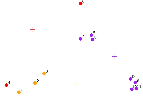
| You can see that you were right and the 6th entry is indeed 3 as you answered
| before. We see the first 3 entries were assigned to the second (orange) cluster and
| only 2 points (4 and 8) were assigned to the first (red) cluster.

...

|=============================== | 40%
| We've stored the vector of cluster colors ("red","orange","purple") in the array
| cols1 for you and we've also stored the cluster assignments in the array newClust.
| Let's color the 12 data points according to their assignments. Again, use the
| command points with 5 arguments. The first 2 are x and y. The third is pch set to
| 19, the fourth is cex set to 2, and the last, col is set to cols1[newClust].

points(x,y,pch=19,cex=2,col=cols1[newClust])

image

| Keep up the great work!

|================================ | 42%
| Now we have to recalculate our centroids so they are the average (center of gravity)
| of the cluster of points assigned to them. We have to do the x and y coordinates
| separately. We'll do the x coordinate first. Recall that the vectors x and y hold
| the respective coordinates of our 12 data points.

...

|================================== | 44%
| We can use the R function tapply which applies "a function over a ragged array".
| This means that every element of the array is assigned a factor and the function is
| applied to subsets of the array (identified by the factor vector). This allows us to
| take advantage of the factor vector newClust we calculated. Call tapply now with 3
| arguments, x (the data), newClust (the factor array), and mean (the function to
| apply).

tapply(x,newClust,mean)

       1        2        3   
1.210767 1.010320 2.498011   

| Perseverance, that's the answer.

|=================================== | 46%
| Repeat the call, except now apply it to the vector y instead of x.

tapply(y,newClust,mean)

       1        2        3   
1.730555 1.016513 1.354373   

| Your dedication is inspiring!

|===================================== | 48%
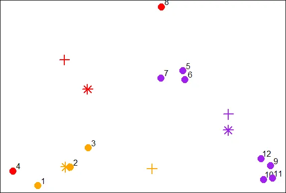
| Now that we have new x and new y coordinates for the 3 centroids we can plot them.
| We've stored off the coordinates for you in variables newCx and newCy. Use the R
| command points with these as the first 2 arguments. In addition, use the arguments
| col set equal to cols1, pch equal to 8, cex equal to 2 and lwd also equal to 2.

points(newCx,newCy,col=cols1,pch=8,cex=2,lwd=2)

image

| Keep up the great work!

|====================================== | 50%
| We see how the centroids have moved closer to their respective clusters. This is
| especially true of the second (orange) cluster. Now call the distance function mdist
| with the 4 arguments x, y, newCx, and newCy. This will allow us to reassign the data
| points to new clusters if necessary.

mdist(x,y,newCx,newCy)

           [,1]        [,2]      [,3]      [,4]      [,5]      [,6]      [,7]     [,8]  
[1,] 0.98911875 0.539152725 0.2901879 1.0286979 0.7936966 0.8004956 0.4650664 1.028698  
[2,] 0.09287262 0.002053041 0.0734304 0.2313694 1.9333732 1.8320407 1.4310971 2.926095  
[3,] 3.28531180 2.197487387 1.6676725 4.0113796 0.4652075 0.3721778 0.6043861 1.643033  
          [,9]    [,10]     [,11]     [,12]  
[1,] 3.3053706 3.282778 3.5391512 2.9345445  
[2,] 3.5224442 3.295301 3.5990955 3.2097944  
[3,] 0.2586908 0.309730 0.3610747 0.1602755  

| Excellent work!

|======================================== | 52%
| We've stored off this new matrix of distances in the matrix distTmp2 for you. Recall
| that the first cluster is red, the second orange and the third purple. Look closely
| at columns 4 and 7 of distTmp2. What will happen to points 4 and 7?

1: They will both change to cluster 2
2: Nothing
3: They're the only points that won't change clusters
4: They will both change clusters

Selection: 4

| You nailed it! Good job!

|========================================== | 54%
| Now call apply with 3 arguments, distTmp2, 2, and which.min to find the new cluster
| assignments for the points.

apply(distTmp2,2,which.min)
[1] 2 2 2 2 3 3 1 1 3 3 3 3

| That's a job well done!

|=========================================== | 56%
| We've stored off the new cluster assignments in a vector of factors called
| newClust2. Use the R function points to recolor the points with their new
| assignments. Again, there are 5 arguments, x and y are first, followed by pch set to
| 19, cex to 2, and col to cols1[newClust2].

points(x,y,pch=19,cex=2,col=cols1[newClust2])

image

| Keep working like that and you'll get there!

|============================================= | 58%
| Notice that points 4 and 7 both changed clusters, 4 moved from 1 to 2 (red to
| orange), and point 7 switched from 3 to 2 (purple to red).

...

|============================================== | 60%
| Now use tapply to find the x coordinate of the new centroid. Recall there are 3
| arguments, x, newClust2, and mean.

tapply(x,newClust2,mean)

        1         2         3   
1.8878628 0.8904553 2.6001704   

| You're the best!

|================================================ | 62%
| Do the same to find the new y coordinate.

tapply(y,newClust2,mean)

       1        2        3   
2.157866 1.006871 1.274675   

| Excellent work!

|================================================= | 64%
| We've stored off these coordinates for you in the variables finalCx and finalCy.
| Plot these new centroids using the points function with 6 arguments. The first 2 are
| finalCx and finalCy. The argument col should equal cols1, pch should equal 9, cex 2
| and lwd 2.

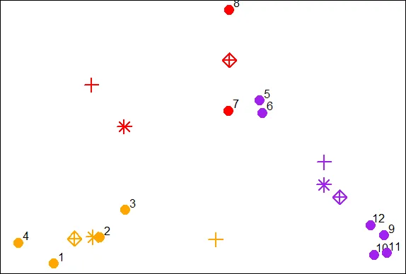
points(finalCx,finalCy,col=cols1,pch=9,cex=2,lwd=2)

image

| You nailed it! Good job!

|=================================================== | 66%
| It should be obvious that if we continued this process points 5 through 8 would all
| turn red, while points 1 through 4 stay orange, and points 9 through 12 purple.

...

|==================================================== | 68%
| Now that you've gone through an example step by step, you'll be relieved to hear
| that R provides a command to do all this work for you. Unsurprisingly it's called
| kmeans and, although it has several parameters, we'll just mention four. These are
| x, (the numeric matrix of data), centers, iter.max, and nstart. The second of these
| (centers) can be either a number of clusters or a set of initial centroids. The
| third, iter.max, specifies the maximum number of iterations to go through, and
| nstart is the number of random starts you want to try if you specify centers as a
| number.

...

|====================================================== | 70%
| Call kmeans now with 2 arguments, dataFrame (which holds the x and y coordinates of
| our 12 points) and centers set equal to 3.

kmeans(dataFrame,centers=3)

K-means clustering with 3 clusters of sizes 4, 4, 4  
  
Cluster means:  

          x         y  
1 0.8904553 1.0068707  
2 2.8534966 0.9831222  
3 1.9906904 2.0078229  
  
Clustering vector:  
 [1] 1 1 1 1 3 3 3 3 2 2 2 2  
  
Within cluster sum of squares by cluster:  
[1] 0.34188313 0.03298027 0.34732441  
 (between_SS / total_SS =  93.6 %)  
  
Available components:  
  
[1] "cluster"      "centers"      "totss"        "withinss"     "tot.withinss"  
[6] "betweenss"    "size"         "iter"         "ifault"        

| You are really on a roll!

|======================================================= | 72%
| The program returns the information that the data clustered into 3 clusters each of
| size 4. It also returns the coordinates of the 3 cluster means, a vector named
| cluster indicating how the 12 points were partitioned into the clusters, and the sum
| of squares within each cluster. It also shows all the available components returned
| by the function. We've stored off this data for you in a kmeans object called kmObj.
| Look at kmObj$iter to see how many iterations the algorithm went through.

kmObj$iter
[1] 1

| You got it!

|========================================================= | 74%
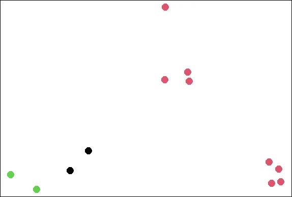
| Two iterations as we did before. We just want to emphasize how you can access the
| information available to you. Let's plot the data points color coded according to
| their cluster. This was stored in kmObj$cluster. Run plot with 5 arguments. The | data, x and y, are the first two; the third, col is set equal to kmObj$cluster, and
| the last two are pch and cex. The first of these should be set to 19 and the last to
| 2.

plot(x,y,col=kmObj$cluster,pch=19,cex=2)

image

| You are doing so well!

|=========================================================== | 76%
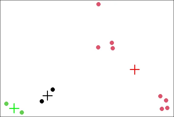
| Now add the centroids which are stored in kmObj$centers. Use the points function | with 5 arguments. The first two are kmObj$centers and col=c("black","red","green").
| The last three, pch, cex, and lwd, should all equal 3.

points(kmObj$centers,col=c("black","red","green"),pch=3,cex=3,lwd=3)

image

| Excellent work!

|============================================================ | 78%
| Now for some fun! We want to show you how the output of the kmeans function is
| affected by its random start (when you just ask for a number of clusters). With
| random starts you might want to run the function several times to get an idea of the
| relationships between your observations. We'll call kmeans with the same data points
| (stored in dataFrame), but ask for 6 clusters instead of 3.

...

|============================================================== | 80%
| We'll plot our data points several times and each time we'll just change the
| argument col which will show us how the R function kmeans is clustering them. So,
| call plot now with 5 arguments. The first 2 are x and y. The third is col set equal
| to the call kmeans(dataFrame,6)$cluster. The last two (pch and cex) are set to 19
| and 2 respectively.

plot(x,y,col=kmeans(dataFrame,6)$cluster,pch=19,cex=2)

image

| You nailed it! Good job!

|=============================================================== | 82%
| See how the points cluster? Now recall your last command and rerun it.

plot(x,y,col=kmeans(dataFrame,6)$cluster,pch=19,cex=2)

image

| Nice work!

|================================================================= | 84%
| See how the clustering has changed? As the Teletubbies would say, "Again! Again!"

plot(x,y,col=kmeans(dataFrame,6)$cluster,pch=19,cex=2)

image

| That's the answer I was looking for.

|================================================================== | 86%
| So the clustering changes with different starts. Perhaps 6 is too many clusters?
| Let's review!

...

|==================================================================== | 88%
| True or False? K-means clustering requires you to specify a number of clusters
| before you begin.

1: False
2: True

Selection: 2

| You nailed it! Good job!

|===================================================================== | 90%
| True or False? K-means clustering requires you to specify a number of iterations
| before you begin.

1: True
2: False

Selection: 2

| You got it right!

|======================================================================= | 92%
| True or False? Every data set has a single fixed number of clusters.

1: False
2: True

Selection: 1

| Excellent job!

|======================================================================== | 94%
| True or False? K-means clustering will always stop in 3 iterations

1: True
2: False

Selection: 2

| You are really on a roll!

|========================================================================== | 96%
| True or False? When starting kmeans with random centroids, you'll always end up with
| the same final clustering.

1: False
2: True

Selection: 1

| Great job!

|=========================================================================== | 98%
| Congratulations! We hope this means you found this lesson oK.

...

|=============================================================================| 100%
| Would you like to receive credit for completing this course on Coursera.org?

1: No
2: Yes

Selection: 2
What is your email address? xxxxxx@xxxxxxxxxxxx
What is your assignment token? xXxXxxXXxXxxXXXx
Grade submission succeeded!

| Excellent work!

| You've reached the end of this lesson! Returning to the main menu...

| Please choose a course, or type 0 to exit swirl.

1: Exploratory Data Analysis
2: Take me to the swirl course repository!

Selection: 0

| Leaving swirl now. Type swirl() to resume.

rm(list=ls())

Last updated 2020-10-02 01:20:12.461303 IST

Hierarchical Clustering

R version 4.0.0 (2020-04-24) -- "Arbor Day"
Copyright (C) 2020 The R Foundation for Statistical Computing
Platform: x86_64-w64-mingw32/x64 (64-bit)

R is free software and comes with ABSOLUTELY NO WARRANTY.
You are welcome to redistribute it under certain conditions.
Type 'license()' or 'licence()' for distribution details.

Natural language support but running in an English locale

R is a collaborative project with many contributors.
Type 'contributors()' for more information and
'citation()' on how to cite R or R packages in publications.

Type 'demo()' for some demos, 'help()' for on-line help, or
'help.start()' for an HTML browser interface to help.
Type 'q()' to quit R.

setwd("C:/images")
library(swirl)

| Hi! Type swirl() when you are ready to begin.

swirl()

| Welcome to swirl! Please sign in. If you've been here before, use the same name as
| you did then. If you are new, call yourself something unique.

What shall I call you? Krishnakanth Allika

| Please choose a course, or type 0 to exit swirl.

1: Exploratory Data Analysis
2: Take me to the swirl course repository!

Selection: 1

| Please choose a lesson, or type 0 to return to course menu.

 1: Principles of Analytic Graphs   2: Exploratory Graphs             
 3: Graphics Devices in R           4: Plotting Systems               
 5: Base Plotting System            6: Lattice Plotting System        
 7: Working with Colors             8: GGPlot2 Part1                  
 9: GGPlot2 Part2                  10: GGPlot2 Extras                 
11: Hierarchical Clustering        12: K Means Clustering             
13: Dimension Reduction            14: Clustering Example             
15: CaseStudy                        

Selection: 11

| Attempting to load lesson dependencies...

| Package ‘ggplot2’ loaded correctly!

| This lesson requires the ‘fields’ package. Would you like me to install it for you
| now?

1: Yes
2: No

Selection: 1

| Trying to install package ‘fields’ now...
WARNING: Rtools is required to build R packages but is not currently installed. Please download and install the appropriate version of Rtools before proceeding:

https://cran.rstudio.com/bin/windows/Rtools/
also installing the dependencies ‘dotCall64’, ‘spam’, ‘maps’

package ‘dotCall64’ successfully unpacked and MD5 sums checked
package ‘spam’ successfully unpacked and MD5 sums checked
package ‘maps’ successfully unpacked and MD5 sums checked
package ‘fields’ successfully unpacked and MD5 sums checked

| Package ‘fields’ loaded correctly!

| Package ‘jpeg’ loaded correctly!

| Package ‘datasets’ loaded correctly!

| | 0%

| Hierarchical_Clustering. (Slides for this and other Data Science courses may be
| found at github https://github.com/DataScienceSpecialization/courses/. If you care
| to use them, they must be downloaded as a zip file and viewed locally. This lesson
| corresponds to 04_ExploratoryAnalysis/hierarchicalClustering.)

...

|= | 2%
| In this lesson we'll learn about hierarchical clustering, a simple way of quickly
| examining and displaying multi-dimensional data. This technique is usually most
| useful in the early stages of analysis when you're trying to get an understanding of
| the data, e.g., finding some pattern or relationship between different factors or
| variables. As the name suggests hierarchical clustering creates a hierarchy of
| clusters.

...

|== | 3%
| Clustering organizes data points that are close into groups. So obvious questions
| are "How do we define close?", "How do we group things?", and "How do we interpret
| the grouping?" Cluster analysis is a very important topic in data analysis.

...

|==== | 5%
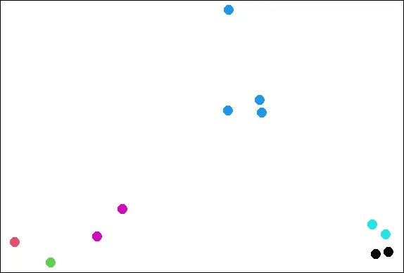
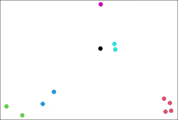
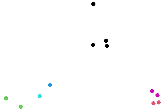
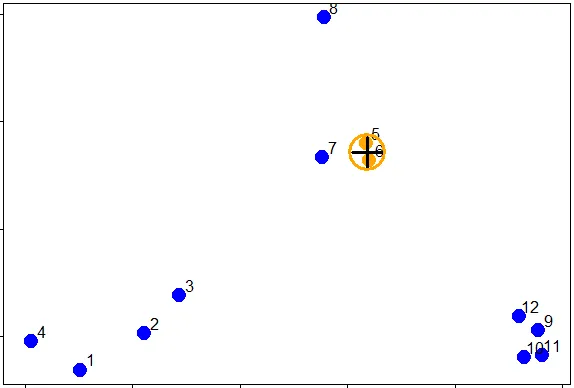
| To give you an idea of what we're talking about, consider these random points we
| generated. We'll use them to demonstrate hierarchical clustering in this lesson.
| We'll do this in several steps, but first we have to clarify our terms and concepts.

image
...

|===== | 6%
| Hierarchical clustering is an agglomerative, or bottom-up, approach. From Wikipedia
| (http://en.wikipedia.org/wiki/Hierarchical_clustering), we learn that in this
| method, "each observation starts in its own cluster, and pairs of clusters are
| merged as one moves up the hierarchy." This means that we'll find the closest two
| points and put them together in one cluster, then find the next closest pair in the
| updated picture, and so forth. We'll repeat this process until we reach a reasonable
| stopping place.

...

|====== | 8%
| Note the word "reasonable". There's a lot of flexibility in this field and how you
| perform your analysis depends on your problem. Again, Wikipedia tells us, "one can
| decide to stop clustering either when the clusters are too far apart to be merged
| (distance criterion) or when there is a sufficiently small number of clusters
| (number criterion)."

...

|======= | 10%
| First, how do we define close? This is the most important step and there are several
| possibilities depending on the questions you're trying to answer and the data you
| have. Distance or similarity are usually the metrics used.

...

|========= | 11%
| In the given plot which pair points would you first cluster? Use distance as the
| metric.

1: 5 and 6
2: 1 and 4
3: 10 and 12
4: 7 and 8

Selection: 1

| Perseverance, that's the answer.

|========== | 13%
| It's pretty obvious that out of the 4 choices, the pair 5 and 6 were the closest
| together. However, there are several ways to measure distance or similarity.
| Euclidean distance and correlation similarity are continuous measures, while
| Manhattan distance is a binary measure. In this lesson we'll just briefly discuss
| the first and last of these. It's important that you use a measure of distance that
| fits your problem.

...

|=========== | 15%
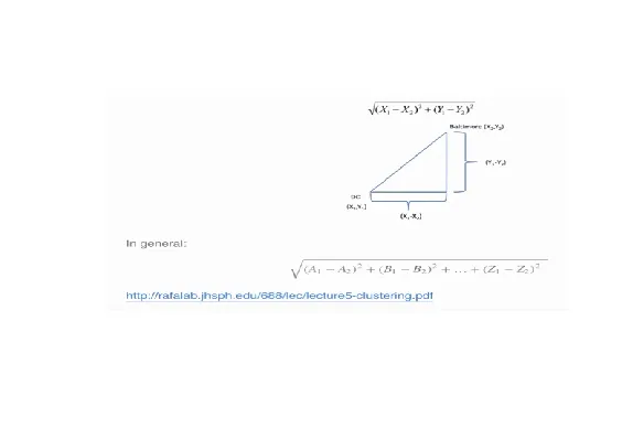
| Euclidean distance is what you learned about in high school algebra. Given two
| points on a plane, (x1,y1) and (x2,y2), the Euclidean distance is the square root of
| the sums of the squares of the distances between the two x-coordinates (x1-x2) and
| the two y-coordinates (y1-y2). You probably recognize this as an application of the
| Pythagorean theorem which yields the length of the hypotenuse of a right triangle.

image
...

|============ | 16%
| It shouldn't be hard to believe that this generalizes to more than two dimensions as
| shown in the formula at the bottom of the picture shown here.

...

|============== | 18%
| Euclidean distance is distance "as the crow flies". Many applications, however,
| can't realistically use crow-flying distance. Cars, for instance, have to follow
| roads.

...

|=============== | 19%
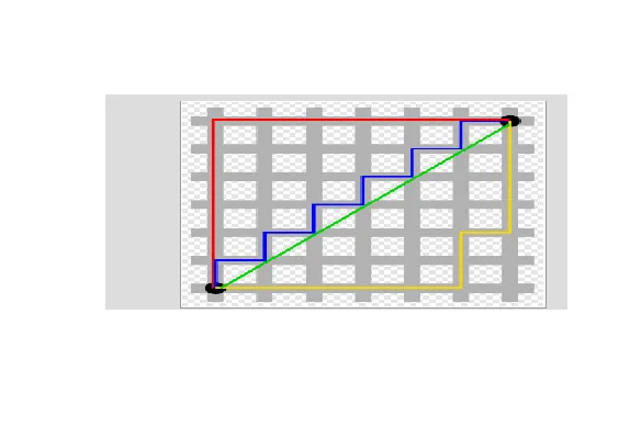
| In this case, we can use Manhattan or city block distance (also known as a taxicab
| metric). This picture, copied from http://en.wikipedia.org/wiki/Taxicab_geometry,
| shows what this means.

image
...

|================ | 21%
| You want to travel from the point at the lower left to the one on the top right. The
| shortest distance is the Euclidean (the green line), but you're limited to the grid,
| so you have to follow a path similar to those shown in red, blue, or yellow. These
| all have the same length (12) which is the number of small gray segments covered by
| their paths.

...

|================= | 23%
| More formally, Manhattan distance is the sum of the absolute values of the distances
| between each coordinate, so the distance between the points (x1,y1) and (x2,y2) is
| |x1-x2|+|y1-y2|. As with Euclidean distance, this too generalizes to more than 2
| dimensions.

...

|=================== | 24%
| Now we'll go back to our random points. You might have noticed that these points
| don't really look randomly positioned, and in fact, they're not. They were actually
| generated as 3 distinct clusters. We've put the coordinates of these points in a
| data frame for you, called dataFrame.

image
...

|==================== | 26%
| We'll use this dataFrame to demonstrate an agglomerative (bottom-up) technique of
| hierarchical clustering and create a dendrogram. This is an abstract picture (or
| graph) which shows how the 12 points in our dataset cluster together. Two clusters
| (initially, these are points) that are close are connected with a line, We'll use
| Euclidean distance as our metric of closeness.

...

|===================== | 27%
| Run the R command dist with the argument dataFrame to compute the distances between
| all pairs of these points. By default dist uses Euclidean distance as its metric,
| but other metrics such as Manhattan, are available. Just use the default.

dist(dataFrame)

            1          2          3          4          5          6          7  
2  0.34120511                                                                    
3  0.57493739 0.24102750                                                         
4  0.26381786 0.52578819 0.71861759                                              
5  1.69424700 1.35818182 1.11952883 1.80666768                                   
6  1.65812902 1.31960442 1.08338841 1.78081321 0.08150268                        
7  1.49823399 1.16620981 0.92568723 1.60131659 0.21110433 0.21666557             
8  1.99149025 1.69093111 1.45648906 2.02849490 0.61704200 0.69791931 0.65062566  
9  2.13629539 1.83167669 1.67835968 2.35675598 1.18349654 1.11500116 1.28582631  
10 2.06419586 1.76999236 1.63109790 2.29239480 1.23847877 1.16550201 1.32063059  
11 2.14702468 1.85183204 1.71074417 2.37461984 1.28153948 1.21077373 1.37369662  
12 2.05664233 1.74662555 1.58658782 2.27232243 1.07700974 1.00777231 1.17740375  
            8          9         10         11  
2                                               
3                                               
4                                               
5                                               
6                                               
7                                               
8                                               
9  1.76460709                                   
10 1.83517785 0.14090406                        
11 1.86999431 0.11624471 0.08317570             
12 1.66223814 0.10848966 0.19128645 0.20802789  

| Great job!

|====================== | 29%
| You see that the output is a lower triangular matrix with rows numbered from 2 to 12
| and columns numbered from 1 to 11. Entry (i,j) indicates the distance between points
| i and j. Clearly you need only a lower triangular matrix since the distance between
| points i and j equals that between j and i.

...

|======================== | 31%
| From the output of dist, what is the minimum distance between two points?

1: 0.08317
2: -0.0700
3: 0.1085
4: 0.0815

Selection: 4

| Excellent job!

|========================= | 32%
| So 0.0815 (units are unspecified) between points 5 and 6 is the shortest distance.
| We can put these points in a single cluster and look for another close pair of
| points.

image
...

|========================== | 34%
| Looking at the picture, what would be another good pair of points to put in another
| cluster given that 5 and 6 are already clustered?

1: 7 and the cluster containing 5 ad 6
2: 10 and 11
3: 7 and 8
4: 1 and 4

Selection: 2

| You are amazing!

|=========================== | 35%
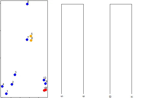
| So 10 and 11 are another pair of points that would be in a second cluster. We'll
| start creating our dendrogram now. Here're the original plot and two beginning
| pieces of the dendrogram.

image
...

|============================= | 37%
| We can keep going like this in the obvious way and pair up individual points, but as
| luck would have it, R provides a simple function which you can call which creates a
| dendrogram for you. It's called hclust() and takes as an argument the pairwise
| distance matrix which we looked at before. We've stored this matrix for you in a
| variable called distxy. Run hclust now with distxy as its argument and put the
| result in the variable hc.

hc<-hclust(distxy)

| Perseverance, that's the answer.

|============================== | 39%
| You're probably curious and want to see hc.

...

|=============================== | 40%
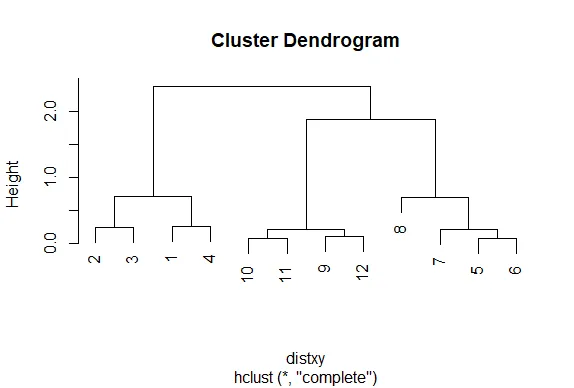
| Call the R function plot with one argument, hc.

plot(hc)

image

| That's correct!

|================================ | 42%
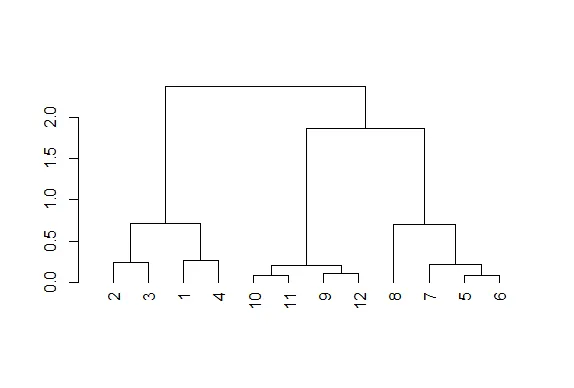
| Nice plot, right? R's plot conveniently labeled everything for you. The points we
| saw are the leaves at the bottom of the graph, 5 and 6 are connected, as are 10 and
| 11. Moreover, we see that the original 3 groupings of points are closest together as
| leaves on the picture. That's reassuring. Now call plot again, this time with the
| argument as.dendrogram(hc).

plot(as.dendrogram(hc))

image

| Keep up the great work!

|================================== | 44%
| The essentials are the same, but the labels are missing and the leaves (original
| points) are all printed at the same level. Notice that the vertical heights of the
| lines and labeling of the scale on the left edge give some indication of distance.
| Use the R command abline to draw a horizontal blue line at 1.5 on this plot. Recall
| that this requires 2 arguments, h=1.5 and col="blue".

abline(h=1.5,col="blue")

| Keep working like that and you'll get there!

|=================================== | 45%
| We see that this blue line intersects 3 vertical lines and this tells us that using
| the distance 1.5 (unspecified units) gives us 3 clusters (1 through 4), (9 through
| 12), and (5 through 8). We call this a "cut" of our dendrogram. Now cut the
| dendrogam by drawing a red horizontal line at .4.

abline(h=0.4,col="red")

| You are really on a roll!

|==================================== | 47%
| How many clusters are there with a cut at this distance?

5
[1] 5

| Keep up the great work!

|===================================== | 48%
| We see that by cutting at .4 we have 5 clusters, indicating that this distance is
| small enough to break up our original grouping of points. If we drew a horizontal
| line at .05, how many clusters would we get

5
[1] 5

| That's not exactly what I'm looking for. Try again. Or, type info() for more
| options.

| Recall that our shortest distance was around .08, so a distance smaller than that
| would make all the points their own private clusters.

12
[1] 12

| Perseverance, that's the answer.

|====================================== | 50%
| Try it now (draw a horizontal line at .05) and make the line green.

abline(h=0.05,col="green")

| Your dedication is inspiring!

|======================================== | 52%
| So the number of clusters in your data depends on where you draw the line! (We said
| there's a lot of flexibility here.) Now that we've seen the practice, let's go back
| to some "theory". Notice that the two original groupings, 5 through 8, and 9 through
| 12, are connected with a horizontal line near the top of the display. You're
| probably wondering how distances between clusters of points are measured.

...

|========================================= | 53%
| There are several ways to do this. We'll just mention two. The first is called
| complete linkage and it says that if you're trying to measure a distance between two
| clusters, take the greatest distance between the pairs of points in those two
| clusters. Obviously such pairs contain one point from each cluster.

...

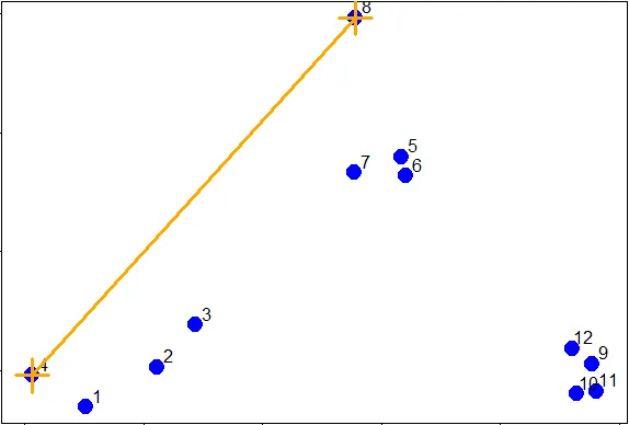
|========================================== | 55%
| So if we were measuring the distance between the two clusters of points (1 through
| 4) and (5 through 8), using complete linkage as the metric we would use the distance
| between points 4 and 8 as the measure since this is the largest distance between the
| pairs of those groups.

image
...

|=========================================== | 56%
| The distance between the two clusters of points (9 through 12) and (5 through 8),
| using complete linkage as the metric, is the distance between points 11 and 8 since
| this is the largest distance between the pairs of those groups.

...

|============================================= | 58%
| As luck would have it, the distance between the two clusters of points (9 through
| 12) and (1 through 4), using complete linkage as the metric, is the distance between
| points 11 and 4.

...

|============================================== | 60%
| We've created the dataframe dFsm for you containing these 3 points, 4, 8, and 11.
| Run dist on dFsm to see what the smallest distance between these 3 points is.

dist(dFsm)
1 2
2 2.028495
3 2.374620 1.869994

| Keep up the great work!

|=============================================== | 61%
| We see that the smallest distance is between points 2 and 3 in this reduced set,
| (these are actually points 8 and 11 in the original set), indicating that the two
| clusters these points represent ((5 through 8) and (9 through 12) respectively)
| would be joined (at a distance of 1.869) before being connected with the third
| cluster (1 through 4). This is consistent with the dendrogram we plotted.

image
...

|================================================ | 63%
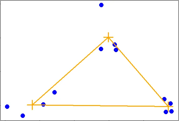
| The second way to measure a distance between two clusters that we'll just mention is
| called average linkage. First you compute an "average" point in each cluster (think
| of it as the cluster's center of gravity). You do this by computing the mean
| (average) x and y coordinates of the points in the cluster.

...

|================================================== | 65%
| Then you compute the distances between each cluster average to compute the
| intercluster distance.

image
...

|=================================================== | 66%
| Now look at the hierarchical cluster we created before, hc.

hc

Call:
hclust(d = distxy)

Cluster method : complete
Distance : euclidean
Number of objects: 12

| Excellent work!

|==================================================== | 68%
| Which type of linkage did hclust() use to agglomerate clusters?

1: complete
2: average

Selection: 1

| You nailed it! Good job!

|===================================================== | 69%
| In our simple set of data, the average and complete linkages aren't that different,
| but in more complicated datasets the type of linkage you use could affect how your
| data clusters. It is a good idea to experiment with different methods of linkage to
| see the varying ways your data groups. This will help you determine the best way to
| continue with your analysis.

...

|======================================================= | 71%
| The last method of visualizing data we'll mention in this lesson concerns heat maps.
| Wikipedia (http://en.wikipedia.org/wiki/Heat_map) tells us a heat map is "a
| graphical representation of data where the individual values contained in a matrix
| are represented as colors. ... Heat maps originated in 2D displays of the values in
| a data matrix. Larger values were represented by small dark gray or black squares
| (pixels) and smaller values by lighter squares."

...

|======================================================== | 73%
| You've probably seen many examples of heat maps, for instance weather radar and
| displays of ocean salinity. From Wikipedia (http://en.wikipedia.org/wiki/Heat_map)
| we learn that heat maps are often used in molecular biology "to represent the level
| of expression of many genes across a number of comparable samples (e.g. cells in
| different states, samples from different patients) as they are obtained from DNA
| microarrays."

...

|========================================================= | 74%
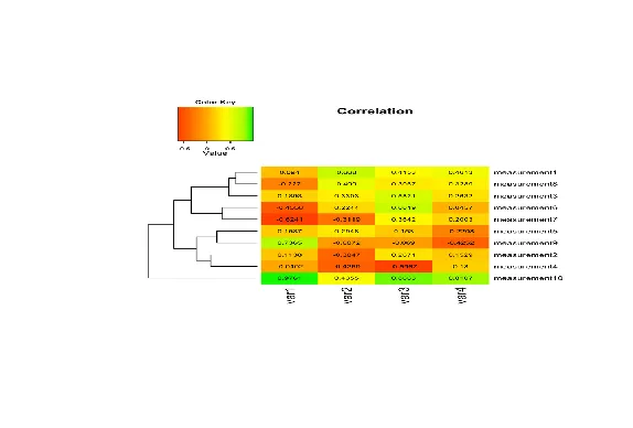
| We won't say too much on this topic, but a very nice concise tutorial on creating
| heatmaps in R exists at
| http://sebastianraschka.com/Articles/heatmaps_in_r.html#clustering. Here's an image
| from the tutorial to start you thinking about the topic. It shows a sample heat map
| with a dendrogram on the left edge mapping the relationship between the rows. The
| legend at the top shows how colors relate to values.

image
...

|========================================================== | 76%
| R provides a handy function to produce heat maps. It's called heatmap. We've put the
| point data we've been using throughout this lesson in a matrix. Call heatmap now
| with 2 arguments. The first is dataMatrix and the second is col set equal to
| cm.colors(25). This last is optional, but we like the colors better than the default
| ones.

heatmap(dataMatrix,col=cm.colors(25))

image

| That's a job well done!

|============================================================ | 77%
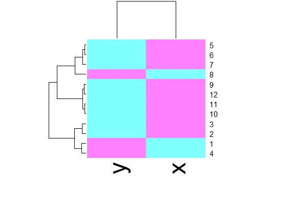
| We see an interesting display of sorts. This is a very simple heat map - simple
| because the data isn't very complex. The rows and columns are grouped together as
| shown by colors. The top rows (labeled 5, 6, and 7) seem to be in the same group
| (same colors) while 8 is next to them but colored differently. This matches the
| dendrogram shown on the left edge. Similarly, 9, 12, 11, and 10 are grouped together
| (row-wise) along with 3 and 2. These are followed by 1 and 4 which are in a separate
| group. Column data is treated independently of rows but is also grouped.

...

|============================================================= | 79%
| We've subsetted some vehicle data from mtcars, the Motor Trend Car Road Tests which
| is part of the package datasets. The data is in the matrix mt and contains 6 factors
| of 11 cars. Run heatmap now with mt as its only argument.

heatmap(mt)

image

| Keep working like that and you'll get there!

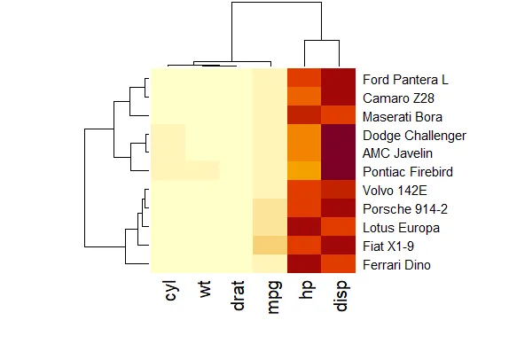
|============================================================== | 81%
| This looks slightly more interesting than the heatmap for the point data. It shows a
| little better how the rows and columns are treated (clustered and colored)
| independently of one another. To understand the disparity in color (between the left
| 4 columns and the right 2) look at mt now.

mt

                  mpg cyl  disp  hp drat    wt  
Dodge Challenger 15.5   8 318.0 150 2.76 3.520  
AMC Javelin      15.2   8 304.0 150 3.15 3.435  
Camaro Z28       13.3   8 350.0 245 3.73 3.840  
Pontiac Firebird 19.2   8 400.0 175 3.08 3.845  
Fiat X1-9        27.3   4  79.0  66 4.08 1.935  
Porsche 914-2    26.0   4 120.3  91 4.43 2.140  
Lotus Europa     30.4   4  95.1 113 3.77 1.513  
Ford Pantera L   15.8   8 351.0 264 4.22 3.170  
Ferrari Dino     19.7   6 145.0 175 3.62 2.770  
Maserati Bora    15.0   8 301.0 335 3.54 3.570  
Volvo 142E       21.4   4 121.0 109 4.11 2.780  

| You're the best!

|=============================================================== | 82%
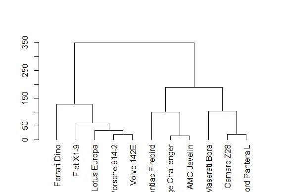
| See how four of the columns are all relatively small numbers and only two (disp and
| hp) are large? That explains the big difference in color columns. Now to understand
| the grouping of the rows call plot with one argument, the dendrogram object denmt
| we've created for you.

plot(denmt)

image

| Excellent work!

|================================================================= | 84%
| We see that this dendrogram is the one displayed at the side of the heat map. How
| was this created? Recall that we generalized the distance formula for more than 2
| dimensions. We've created a distance matrix for you, distmt. Look at it now.

distmt

                 Dodge Challenger AMC Javelin Camaro Z28 Pontiac Firebird Fiat X1-9  
AMC Javelin              14.00890                                                    
Camaro Z28              100.27404   105.57041                                        
Pontiac Firebird         85.80733    99.28330   86.22779                             
Fiat X1-9               253.64640   240.51305  325.11191        339.12867            
Porsche 914-2           206.63309   193.29419  276.87318        292.15588  48.29642  
Lotus Europa            226.48724   212.74240  287.59666        311.37656  49.78046  
Ford Pantera L          118.69012   123.31494   19.20778        101.66275 336.65679  
Ferrari Dino            174.86264   161.03078  216.72821        255.01117 127.67016  
Maserati Bora           185.78176   185.02489  102.48902        188.19917 349.02042  
Volvo 142E              201.35337   187.68535  266.49555        286.74036  60.40302  
                 Porsche 914-2 Lotus Europa Ford Pantera L Ferrari Dino Maserati Bora  
AMC Javelin                                                                            
Camaro Z28                                                                             
Pontiac Firebird                                                                       
Fiat X1-9                                                                              
Porsche 914-2                                                                          
Lotus Europa          33.75246                                                         
Ford Pantera L       288.56998    297.51961                                            
Ferrari Dino          87.81135     80.33743      224.44761                             
Maserati Bora        303.85577    303.20992       86.84620    223.52346                
Volvo 142E            18.60543     27.74042      277.43923     70.27895     289.02233  

| You nailed it! Good job!

|================================================================== | 85%
| See how these distances match those in the dendrogram? So hclust really works!
| Let's review now.

...

|=================================================================== | 87%
| What is the purpose of hierarchical clustering?

1: Inspire other researchers
2: Give an idea of the relationships between variables or observations
3: None of the others
4: Present a finished picture

Selection:
Enter an item from the menu, or 0 to exit
Selection: 2

| You are amazing!

|==================================================================== | 89%
| True or False? When you're doing hierarchical clustering there are strict rules that
| you MUST follow.

1: False
2: True

Selection: 1

| You got it!

|====================================================================== | 90%
| True or False? There's only one way to measure distance.

1: False
2: True

Selection: 1

| Excellent work!

|======================================================================= | 92%
| True or False? Complete linkage is a method of computing distances between clusters.

1: True
2: False

Selection: 1

| That's a job well done!

|======================================================================== | 94%
| True or False? Average linkage uses the maximum distance between points of two
| clusters as the distance between those clusters.

1: True
2: False

Selection: 2

| You nailed it! Good job!

|========================================================================= | 95%
| True or False? The number of clusters you derive from your data depends on the
| distance at which you choose to cut it.

1: True
2: False

Selection: 1

| Your dedication is inspiring!

|=========================================================================== | 97%
| True or False? Once you decide basics, such as defining a distance metric and
| linkage method, hierarchical clustering is deterministic.

1: True
2: False

Selection: 1

| You nailed it! Good job!

|============================================================================ | 98%
| Congratulations! We hope this lesson didn't fluster you or get you too heated!

...

|=============================================================================| 100%
| Would you like to receive credit for completing this course on Coursera.org?

1: No
2: Yes

Selection: 2
What is your email address? xxxxxx@xxxxxxxxxxxx
What is your assignment token? xXxXxxXXxXxxXXXx
Grade submission succeeded!

| That's the answer I was looking for.

| You've reached the end of this lesson! Returning to the main menu...

| Please choose a course, or type 0 to exit swirl.

1: Exploratory Data Analysis
2: Take me to the swirl course repository!

Selection: 0

| Leaving swirl now. Type swirl() to resume.

rm(list=ls())

Last updated 2020-10-02 01:19:36.088624 IST

GGPlot2 Extras

R version 4.0.0 (2020-04-24) -- "Arbor Day"
Copyright (C) 2020 The R Foundation for Statistical Computing
Platform: x86_64-w64-mingw32/x64 (64-bit)

R is free software and comes with ABSOLUTELY NO WARRANTY.
You are welcome to redistribute it under certain conditions.
Type 'license()' or 'licence()' for distribution details.

Natural language support but running in an English locale

R is a collaborative project with many contributors.
Type 'contributors()' for more information and
'citation()' on how to cite R or R packages in publications.

Type 'demo()' for some demos, 'help()' for on-line help, or
'help.start()' for an HTML browser interface to help.
Type 'q()' to quit R.

setwd("C:/images")
library(swirl)

| Hi! Type swirl() when you are ready to begin.

swirl()

| Welcome to swirl! Please sign in. If you've been here before, use the same name as
| you did then. If you are new, call yourself something unique.

What shall I call you? Krishnakanth Allika

| Please choose a course, or type 0 to exit swirl.

1: Exploratory Data Analysis
2: Take me to the swirl course repository!

Selection: 1

| Please choose a lesson, or type 0 to return to course menu.

 1: Principles of Analytic Graphs   2: Exploratory Graphs             
 3: Graphics Devices in R           4: Plotting Systems               
 5: Base Plotting System            6: Lattice Plotting System        
 7: Working with Colors             8: GGPlot2 Part1                  
 9: GGPlot2 Part2                  10: GGPlot2 Extras                 
11: Hierarchical Clustering        12: K Means Clustering             
13: Dimension Reduction            14: Clustering Example             
15: CaseStudy                        

Selection: 10

| Attempting to load lesson dependencies...

| Package ‘ggplot2’ loaded correctly!

| | 0%

| GGPlot2_Extras. (Slides for this and other Data Science courses may be found at
| github https://github.com/DataScienceSpecialization/courses/. If you care to use
| them, they must be downloaded as a zip file and viewed locally. This lesson
| corresponds to 04_ExploratoryAnalysis/ggplot2.)

...

|= | 2%
| In this lesson we'll go through a few more qplot examples using diamond data which
| comes with the ggplot2 package. This data is a little more complicated than the mpg
| data and it contains information on various characteristics of diamonds.

...

|=== | 4%
| Run the R command str with the argument diamonds to see what the data looks like.

str(diamonds)

tibble [53,940 x 10] (S3: tbl_df/tbl/data.frame)  
 $ carat  : num [1:53940] 0.23 0.21 0.23 0.29 0.31 0.24 0.24 0.26 0.22 0.23 ...  
 $ cut    : Ord.factor w/ 5 levels "Fair"<"Good"<..: 5 4 2 4 2 3 3 3 1 3 ...  
 $ color  : Ord.factor w/ 7 levels "D"<"E"<"F"<"G"<..: 2 2 2 6 7 7 6 5 2 5 ...  
 $ clarity: Ord.factor w/ 8 levels "I1"<"SI2"<"SI1"<..: 2 3 5 4 2 6 7 3 4 5 ...  
 $ depth  : num [1:53940] 61.5 59.8 56.9 62.4 63.3 62.8 62.3 61.9 65.1 59.4 ...  
 $ table  : num [1:53940] 55 61 65 58 58 57 57 55 61 61 ...  
 $ price  : int [1:53940] 326 326 327 334 335 336 336 337 337 338 ...  
 $ x      : num [1:53940] 3.95 3.89 4.05 4.2 4.34 3.94 3.95 4.07 3.87 4 ...  
 $ y      : num [1:53940] 3.98 3.84 4.07 4.23 4.35 3.96 3.98 4.11 3.78 4.05 ...  
 $ z      : num [1:53940] 2.43 2.31 2.31 2.63 2.75 2.48 2.47 2.53 2.49 2.39 ...  

| Keep working like that and you'll get there!

|==== | 6%
| From the output, how many characteristics of diamonds do you think this data
| contains?

1: 53950
2: 53940
3: 10
4: 5394

Selection: 3

| You are doing so well!

|====== | 7%
| From the output of str, how many diamonds are characterized in this dataset?

1: 53950
2: 10
3: 5394
4: 53940

Selection: 1

| You're close...I can feel it! Try it again.

| The output says there are 53940 observations of 10 variables. This is followed by a
| 10-long list of characteristics (carat, cut, color, etc.) that can apply to
| diamonds.

1: 5394
2: 53940
3: 10
4: 53950

Selection: 2

| You got it!

|======= | 9%
| Now let's plot a histogram of the price of the 53940 diamonds in this dataset.
| Recall that a histogram requires only one variable of the data, so run the R command
| qplot with the first argument price and the argument data set equal to diamonds.
| This will show the frequency of different diamond prices.

qplot(price,data=diamonds)
stat_bin() using bins = 30. Pick better value with binwidth.

image

| Excellent work!

|========= | 11%
| Not only do you get a histogram, but you also get a message about the binwidth
| defaulting to range/30. Recall that range refers to the spread or dispersion of the
| data, in this case price of diamonds. Run the R command range now with
| diamonds$price as its argument.

range(diamonds$price)
[1] 326 18823

| You nailed it! Good job!

|========== | 13%
| We see that range returned the minimum and maximum prices, so the diamonds vary in
| price from $326 to $18823. We've done the arithmetic for you, the range (difference
| between these two numbers) is $18497.

...

|=========== | 15%
| Rerun qplot now with 3 arguments. The first is price, the second is data set equal
| to diamonds, and the third is binwidth set equal to 18497/30). (Use the up arrow to
| save yourself some typing.) See if the plot looks familiar.

qplot(price,data=diamonds,binwidth=18497/30)

image

| All that practice is paying off!

|============= | 17%
| No more messages in red, but a histogram almost identical to the previous one! If
| you typed 18497/30 at the command line you would get the result 616.5667. This means
| that the height of each bin tells you how many diamonds have a price between x and
| x+617 where x is the left edge of the bin.

...

|============== | 19%
| We've created a vector containing integers that are multiples of 617 for you. It's
| called brk. Look at it now.

brk

 [1]     0   617  1234  1851  2468  3085  3702  4319  4936  5553  6170  6787  7404  
[14]  8021  8638  9255  9872 10489 11106 11723 12340 12957 13574 14191 14808 15425  
[27] 16042 16659 17276 17893 18510 19127  

| You are amazing!

|================ | 20%
| We've also created a vector containing the number of diamonds with prices between
| each pair of adjacent entries of brk. For instance, the first count is the number of
| diamonds with prices between 0 and $617, and the second is the number of diamonds | with prices between $617 and $1234. Look at the vector named counts now.

counts

 [1]  4611 13255  5230  4262  3362  2567  2831  2841  2203  1666  1445  1112   987  
[14]   766   796   655   606   553   540   427   429   376   348   338   298   305  
[27]   269   287   227   251    97  

| You nailed it! Good job!

|================= | 22%
| See how it matches the histogram you just plotted? So, qplot really works!

...

|=================== | 24%
| You're probably sick of it but rerun qplot again, this time with 4 arguments. The
| first 3 are the same as the last qplot command you just ran (price, data set equal
| to diamonds, and binwidth set equal to 18497/30). (Use the up arrow to save yourself
| some typing.) The fourth argument is fill set equal to cut. The shape of the
| histogram will be familiar, but it will be more colorful.

qplot(price,data=diamonds,binwidth=18497/30,fill=cut)

image

| You're the best!

|==================== | 26%
| This shows how the counts within each price grouping (bin) are distributed among the
| different cuts of diamonds. Notice how qplot displays these distributions relative
| to the cut legend on the right. The fair cut diamonds are at the bottom of each bin,
| the good cuts are above them, then the very good above them, until the ideal cuts
| are at the top of each bin. You can quickly see from this display that there are
| very few fair cut diamonds priced above $5000.

...

|===================== | 28%
| Now we'll replot the histogram as a density function which will show the proportion
| of diamonds in each bin. This means that the shape will be similar but the scale on
| the y-axis will be different since, by definition, the density function is
| nonnegative everywhere, and the area under the curve is one. To do this, simply call
| qplot with 3 arguments. The first 2 are price and data (set equal to diamonds). The
| third is geom which should be set equal to the string "density". Try this now.

qplot(price,data=diamonds,geom="density")

image

| Your dedication is inspiring!

|======================= | 30%
| Notice that the shape is similar to that of the histogram we saw previously. The
| highest peak is close to 0 on the x-axis meaning that most of the diamonds in the
| dataset were inexpensive. In general, as prices increase (move right along the
| x-axis) the number of diamonds (at those prices) decrease. The exception to this is
| when the price is around $4000; there's a slight increase in frequency. Let's see if
| cut is responsible for this increase.

...

|======================== | 31%
| Rerun qplot, this time with 4 arguments. The first 2 are the usual, and the third is
| geom set equal to "density". The fourth is color set equal to cut. Try this now.

qplot(price,data=diamonds,geom="density",color=cut)

image

| Keep working like that and you'll get there!

|========================== | 33%
| See how easily qplot did this? Four of the five cuts have 2 peaks, one at price
| $1000 and the other between $4000 and $5000. The exception is the Fair cut which has | a single peak at $2500. This gives us a little more understanding of the histogram
| we saw before.

...

|=========================== | 35%
| Let's move on to scatterplots. For these we'll need to specify two variables from
| the diamond dataset.

...

|============================= | 37%
| Let's start with carat and price. Use these as the first 2 arguments of qplot. The
| third should be data set equal to the dataset. Try this now.

qplot(carat,price,data=diamonds)

image

| You got it right!

|============================== | 39%
| We see the positive trend here, as the number of carats increases the price also
| goes up.

...

|=============================== | 41%
| Now rerun the same command, except add a fourth parameter, shape, set equal to cut.

qplot(carat,price,data=diamonds,shape=cut)
Warning message:
Using shapes for an ordinal variable is not advised

image

| You are doing so well!

|================================= | 43%
| The same scatterplot appears, except the cuts of the diamonds are distinguished by
| different symbols. The legend at the right tells you which symbol is associated with
| each cut. These are small and hard to read, so rerun the same command, except this
| time instead of setting the argument shape equal to cut, set the argument color
| equal to cut.

qplot(carat,price,data=diamonds,color=cut)

image

| Excellent job!

|================================== | 44%
| That's easier to see! Now we'll close with two, more complicated scatterplot
| examples.

...

|==================================== | 46%
| We'll rerun the plot you just did (carat,price,data=diamonds and color=cut) but add
| an additional parameter. Use geom_smooth with the method set equal to the string
| "lm".

qplot(carat,price,data=diamonds,color=cut)+geom_smooth(method="lm")
geom_smooth() using formula 'y ~ x'

image

| That's a job well done!

|===================================== | 48%
| Again, we see the same scatterplot, but slightly more compressed and showing 5
| regression lines, one for each cut of diamonds. It might be hard to see, but around
| each line is a shadow showing the 95% confidence interval. We see, unsurprisingly,
| that the better the cut, the steeper (more positive) the slope of the lines.

...

|====================================== | 50%
| Finally, let's rerun that plot you just did qplot(carat,price,data=diamonds,
| color=cut) + geom_smooth(method="lm") but add one (just one) more argument to qplot.
| The new argument is facets and it should be set equal to the formula .~cut. Recall
| that the facets argument indicates we want a multi-panel plot. The symbol to the
| left of the tilde indicates rows (in this case just one) and the symbol to the right
| of the tilde indicates columns (in this five, the number of cuts). Try this now.

qplot(carat,price,data=diamonds,color=cut,facets=.~cut)+geom_smooth(method="lm")
geom_smooth() using formula 'y ~ x'

image

| You are quite good my friend!

|======================================== | 52%
| Pretty good, right? Not too difficult either. Let's review what we learned!

...

|========================================= | 54%
| Which types of plot does qplot plot?

1: box and whisker plots
2: histograms
3: all of the others
4: scatterplots

Selection: 3

| You are doing so well!

|=========================================== | 56%
| Any and all of the above choices work; qplot is just that good. What does the gg in
| ggplot2 stand for?

1: good grief
2: goto graphics
3: grammar of graphics
4: good graphics

Selection: 3

| You are amazing!

|============================================ | 57%
| True or False? The geom argument takes a string for a value.

1: False
2: True

Selection: 2

| You are really on a roll!

|============================================== | 59%
| True or False? The method argument takes a string for a value.

1: True
2: False

Selection: 1

| You got it!

|=============================================== | 61%
| True or False? The binwidth argument takes a string for a value.

1: True
2: False

Selection: 2

| You nailed it! Good job!

|================================================ | 63%
| True or False? The user must specify x- and y-axis labels when using qplot.

1: False
2: True

Selection: 1

| That's correct!

|================================================== | 65%
| Now for some ggplots.

...

|=================================================== | 67%
| First create a graphical object g by assigning to it the output of a call to the
| function ggplot with 2 arguments. The first is the dataset diamonds and the second
| is a call to the function aes with 2 arguments, depth and price. Remember you won't
| see any result.

g<-ggplot(data=diamonds,aes(depth,price))

| You are quite good my friend!

|===================================================== | 69%
| Does g exist? Yes! Type summary with g as an argument to see what it holds.

summary(g)

data: carat, cut, color, clarity, depth, table, price, x, y, z [53940x10]  
mapping:  x = ~depth, y = ~price  
faceting: <ggproto object: Class FacetNull, Facet, gg>  
    compute_layout: function  
    draw_back: function  
    draw_front: function  
    draw_labels: function  
    draw_panels: function  
    finish_data: function  
    init_scales: function  
    map_data: function  
    params: list  
    setup_data: function  
    setup_params: function  
    shrink: TRUE  
    train_scales: function  
    vars: function  
    super:  <ggproto object: Class FacetNull, Facet, gg>  

| That's a job well done!

|====================================================== | 70%
| We see that g holds the entire dataset. Now suppose we want to see a scatterplot of
| the relationship. Add to g a call to the function geom_point with 1 argument, alpha
| set equal to 1/3.

g+geom_point(alpha=1/3)

image

| You're the best!

|======================================================== | 72%
| That's somewhat interesting. We see that depth ranges from 43 to 79, but the densest
| distribution is around 60 to 65. Suppose we want to see if this relationship
| (between depth and price) is affected by cut or carat. We know cut is a factor with
| 5 levels (Fair, Good, Very Good, Premium, and Ideal). But carat is numeric and not a
| discrete factor. Can we do this?

...

|========================================================= | 74%
| Of course! That's why we asked. R has a handy command, cut, which allows you to
| divide your data into sets and label each entry as belonging to one of the sets, in
| effect creating a new factor. First, we'll have to decide where to cut the data.

...

|========================================================== | 76%
| Let's divide the data into 3 pockets, so 1/3 of the data falls into each. We'll use
| the R command quantile to do this. Create the variable cutpoints and assign to it
| the output of a call to the function quantile with 3 arguments. The first is the
| data to cut, namely diamonds$carat; the second is a call to the R function seq. This
| is also called with 3 arguments, (0, 1, and length set equal to 4). The third
| argument to the call to quantile is the boolean na.rm set equal to TRUE.

cutpoints<-quantile(diamonds$carat,seq(0,1,length=4),na.rm=TRUE)

| Keep working like that and you'll get there!

|============================================================ | 78%
| Look at cutpoints now to understand what it is.

cutpoints

   0% 33.33333% 66.66667%      100%   
 0.20      0.50      1.00      5.01   

| You got it right!

|============================================================= | 80%
| We see a 4-long vector (explaining why length was set equal to 4). We also see that
| .2 is the smallest carat size in the dataset and 5.01 is the largest. One third of
| the diamonds are between .2 and .5 carats and another third are between .5 and 1
| carat in size. The remaining third are between 1 and 5.01 carats. Now we can use the
| R command cut to label each of the 53940 diamonds in the dataset as belonging to one
| of these 3 factors. Create a new name in diamonds, diamonds$car2 by assigning it the | output of the call to cut. This command takes 2 arguments, diamonds$carat, which is
| what we want to cut, and cutpoints, the places where we'll cut.

diamonds$car2<-cut(diamonds$carat,cutpoints)

| You are quite good my friend!

|=============================================================== | 81%
| Now we can continue with our multi-facet plot. First we have to reset g since we
| changed the dataset (diamonds) it contained (by adding a new column). Assign to g
| the output of a call to ggplot with 2 arguments. The dataset diamonds is the first,
| and a call to the function aes with 2 arguments (depth,price) is the second.

g<-ggplot(data=diamonds,aes(depth,price))

| You're the best!

|================================================================ | 83%
| Now add to g calls to 2 functions. This first is a call to geom_point with the
| argument alpha set equal to 1/3. The second is a call to the function facet_grid
| using the formula cut ~ car2 as its argument.

g+geom_point(alpha=1/3)+facet_grid(cut~car2)

image

| That's correct!

|================================================================== | 85%
| We see a multi-facet plot with 5 rows, each corresponding to a cut factor. Not
| surprising. What is surprising is the number of columns. We were expecting 3 and got
| 4. Why?

...

|=================================================================== | 87%
| The first 3 columns are labeled with the cutpoint boundaries. The fourth is labeled
| NA and shows us where the data points with missing data (NA or Not Available)
| occurred. We see that there were only a handful (12 in fact) and they occurred in
| Very Good, Premium, and Ideal cuts. We created a vector, myd, containing the indices
| of these datapoints. Look at these entries in diamonds by typing the expression
| diamonds[myd,]. The myd tells R what rows to show and the empty column entry says to
| print all the columns.

diamonds[myd,]

# A tibble: 12 x 11  
   carat cut       color clarity depth table price     x     y     z car2   
   <dbl> <ord>     <ord> <ord>   <dbl> <dbl> <int> <dbl> <dbl> <dbl> <fct>  
 1   0.2 Premium   E     SI2      60.2    62   345  3.79  3.75  2.27 NA     
 2   0.2 Premium   E     VS2      59.8    62   367  3.79  3.77  2.26 NA     
 3   0.2 Premium   E     VS2      59      60   367  3.81  3.78  2.24 NA     
 4   0.2 Premium   E     VS2      61.1    59   367  3.81  3.78  2.32 NA     
 5   0.2 Premium   E     VS2      59.7    62   367  3.84  3.8   2.28 NA     
 6   0.2 Ideal     E     VS2      59.7    55   367  3.86  3.84  2.3  NA     
 7   0.2 Premium   F     VS2      62.6    59   367  3.73  3.71  2.33 NA     
 8   0.2 Ideal     D     VS2      61.5    57   367  3.81  3.77  2.33 NA     
 9   0.2 Very Good E     VS2      63.4    59   367  3.74  3.71  2.36 NA     
10   0.2 Ideal     E     VS2      62.2    57   367  3.76  3.73  2.33 NA     
11   0.2 Premium   D     VS2      62.3    60   367  3.73  3.68  2.31 NA     
12   0.2 Premium   D     VS2      61.7    60   367  3.77  3.72  2.31 NA     

| You're the best!

|==================================================================== | 89%
| We see these entries match the plots. Whew - that's a relief. The car2 field is, in
| fact, NA for these entries, but the carat field shows they each had a carat size of
| .2. What's going on here?

...

|====================================================================== | 91%
| Actually our plot answers this question. The boundaries for each column appear in
| the gray labels at the top of each column, and we see that the first column is
| labeled (0.2,0.5]. This indicates that this column contains data greater than .2 and
| less than or equal to .5. So diamonds with carat size .2 were excluded from the car2
| field.

...

|======================================================================= | 93%
| Finally, recall the last plotting command
| (g+geom_point(alpha=1/3)+facet_grid(cut~car2)) or retype it if you like and add
| another call. This one to the function geom_smooth. Pass it 3 arguments, method set
| equal to the string "lm", size set equal to 3, and color equal to the string "pink".

play()

| Entering play mode. Experiment as you please, then type nxt() when you are ready to
| resume the lesson.

diamonds[is.na(diamonds$car2),]

# A tibble: 12 x 11  
   carat cut       color clarity depth table price     x     y     z car2   
   <dbl> <ord>     <ord> <ord>   <dbl> <dbl> <int> <dbl> <dbl> <dbl> <fct>  
 1   0.2 Premium   E     SI2      60.2    62   345  3.79  3.75  2.27 NA     
 2   0.2 Premium   E     VS2      59.8    62   367  3.79  3.77  2.26 NA     
 3   0.2 Premium   E     VS2      59      60   367  3.81  3.78  2.24 NA     
 4   0.2 Premium   E     VS2      61.1    59   367  3.81  3.78  2.32 NA     
 5   0.2 Premium   E     VS2      59.7    62   367  3.84  3.8   2.28 NA     
 6   0.2 Ideal     E     VS2      59.7    55   367  3.86  3.84  2.3  NA     
 7   0.2 Premium   F     VS2      62.6    59   367  3.73  3.71  2.33 NA     
 8   0.2 Ideal     D     VS2      61.5    57   367  3.81  3.77  2.33 NA     
 9   0.2 Very Good E     VS2      63.4    59   367  3.74  3.71  2.36 NA     
10   0.2 Ideal     E     VS2      62.2    57   367  3.76  3.73  2.33 NA     
11   0.2 Premium   D     VS2      62.3    60   367  3.73  3.68  2.31 NA     
12   0.2 Premium   D     VS2      61.7    60   367  3.77  3.72  2.31 NA     

nxt()

| Resuming lesson...

| Finally, recall the last plotting command
| (g+geom_point(alpha=1/3)+facet_grid(cut~car2)) or retype it if you like and add
| another call. This one to the function geom_smooth. Pass it 3 arguments, method set
| equal to the string "lm", size set equal to 3, and color equal to the string "pink".

g+geom_point(alpha=1/3)+facet_grid(cut~car2)+geom_smooth(method="lm",size=3,color="pink")
geom_smooth() using formula 'y ~ x'

image

| Keep up the great work!

|========================================================================= | 94%
| Nice thick regression lines which are somewhat interesting. You can add labels to
| the plot if you want but we'll let you experiment on your own.

...

|========================================================================== | 96%
| Lastly, ggplot2 can, of course, produce boxplots. This final exercise is the sum of
| 3 function calls. The first call is to ggplot with 2 arguments, diamonds and a call
| to aes with carat and price as arguments. The second call is to geom_boxplot with no
| arguments. The third is to facet_grid with one argument, the formula . ~ cut. Try
| this now.

ggplot(diamonds,aes(carat,price))+geom_boxplot()+facet_grid(.~cut)
Warning message:
Continuous y aesthetic -- did you forget aes(group=...)?

image

| Perseverance, that's the answer.

|============================================================================ | 98%
| Yes! A boxplot looking like marshmallows about to be roasted. Well done and
| congratulations! You've finished this jewel of a lesson. Hope it paid off!

...

|=============================================================================| 100%
| Would you like to receive credit for completing this course on Coursera.org?

1: Yes
2: No

Selection: 1
What is your email address? xxxxxx@xxxxxxxxxxxx
What is your assignment token? xXxXxxXXxXxxXXXx
Grade submission succeeded!

| Excellent job!

| You've reached the end of this lesson! Returning to the main menu...

| Please choose a course, or type 0 to exit swirl.

1: Exploratory Data Analysis
2: Take me to the swirl course repository!

Selection: 0

| Leaving swirl now. Type swirl() to resume.

rm(list=ls())

Last updated 2020-10-02 01:18:23.161238 IST

GGPlot2 Part2

library(swirl)
swirl()

| Welcome to swirl! Please sign in. If you've been here before, use the same name as
| you did then. If you are new, call yourself something unique.

What shall I call you? Krishnakanth Allika

| Please choose a course, or type 0 to exit swirl.

1: Exploratory Data Analysis
2: Take me to the swirl course repository!

Selection: 1

| Please choose a lesson, or type 0 to return to course menu.

 1: Principles of Analytic Graphs   2: Exploratory Graphs             
 3: Graphics Devices in R           4: Plotting Systems               
 5: Base Plotting System            6: Lattice Plotting System        
 7: Working with Colors             8: GGPlot2 Part1                  
 9: GGPlot2 Part2                  10: GGPlot2 Extras                 
11: Hierarchical Clustering        12: K Means Clustering             
13: Dimension Reduction            14: Clustering Example             
15: CaseStudy                        

Selection: 9

| Attempting to load lesson dependencies...

| Package ‘ggplot2’ loaded correctly!

| | 0%

| GGPlot2_Part2. (Slides for this and other Data Science courses may be found at github
| https://github.com/DataScienceSpecialization/courses/. If you care to use them, they
| must be downloaded as a zip file and viewed locally. This lesson corresponds to
| 04_ExploratoryAnalysis/ggplot2.)

...

|== | 2%
| In a previous lesson we showed you the vast capabilities of qplot, the basic
| workhorse function of the ggplot2 package. In this lesson we'll focus on some
| fundamental components of the package. These underlie qplot which uses default values
| when it calls them. If you understand these building blocks, you will be better able
| to customize your plots. We'll use the second workhorse function in the package,
| ggplot, as well as other graphing functions.

...

|=== | 4%
| Do you remember what the gg of ggplot2 stands for?

1: grammar of graphics
2: good grief
3: great graphics
4: goto graphics

Selection: 1

| That's the answer I was looking for.

|===== | 6%
| A "grammar" of graphics means that ggplot2 contains building blocks with which you
| can create your own graphical objects. What are these basic components of ggplot2
| plots? There are 7 of them.

...

|====== | 8%
| Obviously, there's a DATA FRAME which contains the data you're trying to plot. Then
| the AESTHETIC MAPPINGS determine how data are mapped to color, size, etc. The GEOMS
| (geometric objects) are what you see in the plot (points, lines, shapes) and FACETS
| are the panels used in conditional plots. You've used these or seen them used in the
| first ggplot2 (qplot) lesson.

...

|======== | 10%
| There are 3 more. STATS are statistical transformations such as binning, quantiles,
| and smoothing which ggplot2 applies to the data. SCALES show what coding an aesthetic
| map uses (for example, male = red, female = blue). Finally, the plots are depicted on
| a COORDINATE SYSTEM. When you use qplot these were taken care of for you.

...

|========== | 12%
| Do you remember what the "artist's palette" model means in the context of plotting?

1: we draw pictures
2: we mix paints
3: plots are built up in layers
4: things get messy

Selection: 3

| You nailed it! Good job!

|=========== | 15%
| As in the base plotting system (and in contrast to the lattice system), when building
| plots with ggplot2, the plots are built up in layers, maybe in several steps. You can
| plot the data, then overlay a summary (for instance, a regression line or smoother)
| and then add any metadata and annotations you need.

...

|============= | 17%
| We'll keep using the mpg data that comes with the ggplot2 package. Recall the
| versatility of qplot. Just as a refresher, call qplot now with 5 arguments. The first
| 3 deal with data - displ, hwy, and data=mpg. The fourth is geom set equal to the
| concatenation of the two strings, "point" and "smooth". The fifth is facets set equal
| to the formula .~drv. Try this now.

qplot(displ,hwy,data=mpg,geom=c("point","smooth"),facets=.~drv)
geom_smooth() using method = 'loess' and formula 'y ~ x'

image

| You got it!

|=============== | 19%
| We see a 3 facet plot, one for each drive type (4, f, and r). Now we'll see how
| ggplot works. We'll build up a similar plot using the basic components of the
| package. We'll do this in a series of steps.

...

|================ | 21%
| First we'll create a variable g by assigning to it the output of a call to ggplot
| with 2 arguments. The first is mpg (our dataset) and the second will tell ggplot what
| we want to plot, in this case, displ and hwy. These are what we want our aesthetics
| to represent so we enclose these as two arguments to the function aes. Try this now.

g<-ggplot(mpg,aes(displ,hwy))

| You are quite good my friend!

|================== | 23%
| Notice that nothing happened? As in the lattice system, ggplot created a graphical
| object which we assigned to the variable g.

...

|==================== | 25%
| Run the R command summary with g as its argument to see what g contains.

summary(g)

data: manufacturer, model, displ, year, cyl, trans, drv, cty, hwy, fl, class  
  [234x11]  
mapping:  x = ~displ, y = ~hwy  
faceting: <ggproto object: Class FacetNull, Facet, gg>  
    compute_layout: function  
    draw_back: function  
    draw_front: function  
    draw_labels: function  
    draw_panels: function  
    finish_data: function  
    init_scales: function  
    map_data: function  
    params: list  
    setup_data: function  
    setup_params: function  
    shrink: TRUE  
    train_scales: function  
    vars: function  
    super:  <ggproto object: Class FacetNull, Facet, gg>  

| You are quite good my friend!

|===================== | 27%
| So g contains the mpg data with all its named components in a 234 by 11 matrix. It
| also contains a mapping, x (displ) and y (hwy) which you specified, and no faceting.

...

|======================= | 29%
| Note that if you tried to print g with the expressions g or print(g) you'd get an
| error! Even though it's a great package, ggplot doesn't know how to display the data
| yet since you didn't specify how you wanted to see it. Now type g+geom_point() and
| see what happens.

g+geom_point()

image

| You are quite good my friend!

|======================== | 31%
| By calling the function geom_point you added a layer. By not assigning the expression
| to a variable you displayed a plot. Notice that you didn't have to pass any arguments
| to the function geom_point. That's because the object g has all the data stored in
| it. (Remember you saw that when you ran summary on g before.) Now use the expression
| you just typed (g + geom_point()) and add to it another layer, a call to
| geom_smooth(). Notice the red message R gives you.

g+geom_point()+geom_smooth()
geom_smooth() using method = 'loess' and formula 'y ~ x'

image

| You got it!

|========================== | 33%
| The gray shadow around the blue line is the confidence band. See how wide it is at
| the right? Let's try a different smoothing function. Use the up arrow to recover the
| expression you just typed, and instead of calling geom_smooth with no arguments, call
| it with the argument method set equal to the string "lm".

g+geom_point()+geom_smooth(method="lm")
geom_smooth() using formula 'y ~ x'

image

| Excellent work!

|============================ | 35%
| By changing the smoothing function to "lm" (linear model) ggplot2 generated a
| regression line through the data. Now recall the expression you just used and add to
| it another call, this time to the function facet_grid. Use the formula . ~ drv as it
| argument. Note that this is the same type of formula used in the calls to qplot.

g+geom_point()+geom_smooth(method="lm")+facet_grid(.~drv)
geom_smooth() using formula 'y ~ x'

image

| Your dedication is inspiring!

|============================= | 38%
| Notice how each panel is labeled with the appropriate factor. All the data associated
| with 4-wheel drive cars is in the leftmost panel, front-wheel drive data is shown in
| the middle panel, and rear-wheel drive data in the rightmost. Notice that this is
| similar to the plot you created at the start of the lesson using qplot. (We used a
| different smoothing function than previously.)

...

|=============================== | 40%
| So far you've just used the default labels that ggplot provides. You can add your own
| annotation using functions such as xlab(), ylab(), and ggtitle(). In addition, the
| function labs() is more general and can be used to label either or both axes as well
| as provide a title. Now recall the expression you just typed and add a call to the
| function ggtitle with the argument "Swirl Rules!".

g+geom_point()+geom_smooth(method="lm")+facet_grid(.~drv)+ggtitle("Swirl Rules!")
geom_smooth() using formula 'y ~ x'

image

| You are doing so well!

|================================ | 42%
| Now that you've seen the basics we'll talk about customizing. Each of the “geom”
| functions (e.g., _point and _smooth) has options to modify it. Also, the function
| theme() can be used to modify aspects of the entire plot, e.g. the position of the
| legend. Two standard appearance themes are included in ggplot. These are theme_gray()
| which is the default theme (gray background with white grid lines) and theme_bw()
| which is a plainer (black and white) color scheme.

...

|================================== | 44%
| Let's practice modifying aesthetics now. We'll use the graphic object g that we
| already filled with mpg data and add a call to the function geom_point, but this time
| we'll give geom_point 3 arguments. Set the argument color equal to "pink", the
| argument size to 4, and the argument alpha to 1/2. Notice that all the arguments are
| set equal to constants.

g+geom_point(color="pink",size=4,alpha=0.5)

image

| You are doing so well!

|==================================== | 46%
| Notice the different shades of pink? That's the result of the alpha aesthetic which
| you set to 1/2. This aesthetic tells ggplot how transparent the points should be.
| Darker circles indicate values hit by multiple data points.

...

|===================================== | 48%
| Now we'll modify the aesthetics so that color indicates which drv type each point
| represents. Again, use g and add to it a call to the function geom_point with 3
| arguments. The first is size set equal to 4, the second is alpha equal to 1/2. The
| third is a call to the function aes with the argument color set equal to drv. Note
| that you MUST use the function aes since the color of the points is data dependent
| and not a constant as it was in the previous example.

g+geom_point(size=4,alpha=0.5,aes(color=drv))

image

| That's a job well done!

|======================================= | 50%
| Notice the helpful legend on the right decoding the relationship between color and
| drv.

...

|========================================= | 52%
| Now we'll practice modifying labels. Again, we'll use g and add to it calls to 3
| functions. First, add a call to geom_point with an argument making the color
| dependent on the drv type (as we did in the previous example). Second, add a call to
| the function labs with the argument title set equal to "Swirl Rules!". Finally, add a
| call to labs with 2 arguments, one setting x equal to "Displacement" and the other
| setting y equal to "Hwy Mileage".

g+geom_point(aes(color=drv))+labs(title="Swirl Rules!")+labs(x="Displacement",y="Hwy Mileage")

image

| You are amazing!

|========================================== | 54%
| Note that you could have combined the two calls to the function labs in the previous
| example. Now we'll practice customizing the geom_smooth calls. Use g and add to it a
| call to geom_point setting the color to drv type (remember to use the call to the aes
| function), size set to 2 and alpha to 1/2. Then add a call to geom_smooth with 4
| arguments. Set size equal to 4, linetype to 3, method to "lm", and se to FALSE.

g+geom_point(aes(color=drv),size=2,alpha=0.5)+geom_smooth(size=4,linetype=3,method="lm",se=FALSE)
geom_smooth() using formula 'y ~ x'

image

| Perseverance, that's the answer.

|============================================ | 56%
| What did these arguments do? The method specified a linear regression (note the
| negative slope indicating that the bigger the displacement the lower the gas
| mileage), the linetype specified that it should be dashed (not continuous), the size
| made the dashes big, and the se flag told ggplot to turn off the gray shadows
| indicating standard errors (confidence intervals).

...

|============================================= | 58%
| Finally, let's do a simple plot using the black and white theme, theme_bw. Specify g
| and add a call to the function geom_point with the argument setting the color to the
| drv type. Then add a call to the function theme_bw with the argument base_family set
| equal to "Times". See if you notice the difference.

g+geom_point(aes(color=drv))+theme_bw(base_family = "Times")
There were 13 warnings (use warnings() to see them)

image

| Nice work!

|=============================================== | 60%
| No more gray background! Also, if you have good eyesight, you'll notice that the font
| in the labels changed.

...

|================================================= | 62%
| One final note before we go through a more complicated, layered ggplot example, and
| this concerns the limits of the axes. We're pointing this out to emphasize a subtle
| difference between ggplot and the base plotting function plot.

...

|================================================== | 65%
| We've created some random x and y data, called myx and myy, components of a dataframe
| called testdat. These represent 100 random normal points, except halfway through, we
| made one of the points be an outlier. That is, we set its y-value to be out of range
| of the other points. Use the base plotting function plot to create a line plot of
| this data. Call it with 4 arguments - myx, myy, type="l", and ylim=c(-3,3). The
| type="l" tells plot you want to display the data as a line instead of as a
| scatterplot.

warning messages from top-level task callback 'mini'
There were 40 warnings (use warnings() to see them)

play()

| Entering play mode. Experiment as you please, then type nxt() when you are ready to
| resume the lesson.

g+geom_point(aes(color=drv))+theme_dark()

image

g+geom_point(aes(color=drv))+theme_minimal()

image

g+geom_point(aes(color=drv))+theme_grey()

image

nxt()

| Resuming lesson...

| We've created some random x and y data, called myx and myy, components of a dataframe
| called testdat. These represent 100 random normal points, except halfway through, we
| made one of the points be an outlier. That is, we set its y-value to be out of range
| of the other points. Use the base plotting function plot to create a line plot of
| this data. Call it with 4 arguments - myx, myy, type="l", and ylim=c(-3,3). The
| type="l" tells plot you want to display the data as a line instead of as a
| scatterplot.

plot(myx,myy,type="l",ylim=c(-3,3))

image

| You got it!

|==================================================== | 67%
| Notice how plot plotted the points in the (-3,3) range for y-values. The outlier at
| (50,100) is NOT shown on the line plot. Now we'll plot the same data with ggplot.
| Recall that the name of the dataframe is testdat. Create the graphical object g with
| a call to ggplot with 2 arguments, testdat (the data) and a call to aes with 2
| arguments, x set equal to myx, and y set equal to myy.

g<-ggplot(data=testdat,aes(x=myx,y=myy))

| You got it!

|====================================================== | 69%
| Now add a call to geom_line with 0 arguments to g.

g+geom_line()

image

| You got it right!

|======================================================= | 71%
| Notice how ggplot DID display the outlier point at (50,100). As a result the rest of
| the data is smashed down so you don't get to see what the bulk of it looks like. The
| single outlier probably isn't important enough to dominate the graph. How do we get
| ggplot to behave more like plot in a situation like this?

...

|========================================================= | 73%
| Let's take a guess that in addition to adding geom_line() to g we also just have to
| add ylim(-3,3) to it as we did with the call to plot. Try this now to see what
| happens.

g+geom_line()+ylim(-3,3)

image

| Perseverance, that's the answer.

|========================================================== | 75%
| Notice that by doing this, ggplot simply ignored the outlier point at (50,100).
| There's a break in the line which isn't very noticeable. Now recall that at the
| beginning of the lesson we mentioned 7 components of a ggplot plot, one of which was
| a coordinate system. This is a situation where using a coordinate system would be
| helpful. Instead of adding ylim(-3,3) to the expression g+geom_line(), add a call to
| the function coord_cartesian with the argument ylim set equal to c(-3,3).

g+geom_line()+coord_cartesian(ylim=c(-3,3))

image

| You are really on a roll!

|============================================================ | 77%
| See the difference? This looks more like the plot produced by the base plot function.
| The outlier y value at x=50 is not shown, but the plot indicates that it is larger
| than 3.

...

|============================================================== | 79%
| We'll close with a more complicated example to show you the full power of ggplot and
| the entire ggplot2 package. We'll continue to work with the mpg dataset.

...

|=============================================================== | 81%
| Start by creating the graphical object g by assigning to it a call to ggplot with 2
| arguments. The first is the dataset and the second is a call to the function aes.
| This call will have 3 arguments, x set equal to displ, y set equal to hwy, and color
| set equal to factor(year). This last will allow us to distinguish between the two
| manufacturing years (1999 and 2008) in our data.

g<-ggplot(data=mpg,aes(x=displ,y=hwy,color=factor(year)))

| All that practice is paying off!

|================================================================= | 83%
| Uh oh! Nothing happened. Does g exist? Of course, it just isn't visible yet since you
| didn't add a layer.

...

|=================================================================== | 85%
| If you typed g at the command line, what would happen?

1: a scatterplot would appear with 2 colors of points
2: I would have to try this to answer the question
3: R would return an error in red

Selection: 3

| You got it!

|==================================================================== | 88%
| We'll build the plot up step by step. First add to g a call to the function
| geom_point with 0 arguments.

g+geom_point()

image

| You nailed it! Good job!

|====================================================================== | 90%
| A simple, yet comfortingly familiar scatterplot appears. Let's make our display a 2
| dimensional multi-panel plot. Recall your last command (with the up arrow) and add to
| it a call the function facet_grid. Give it 2 arguments. The first is the formula
| drv~cyl, and the second is the argument margins set equal to TRUE. Try this now.

g+geom_point()+facet_grid(drv~cyl,margins=TRUE)

image

| Keep up the great work!

|======================================================================== | 92%
| A 4 by 5 plot, huh? The margins argument tells ggplot to display the marginal totals
| over each row and column, so instead of seeing 3 rows (the number of drv factors) and
| 4 columns (the number of cyl factors) we see a 4 by 5 display. Note that the panel in
| position (4,5) is a tiny version of the scatterplot of the entire dataset.

...

|========================================================================= | 94%
| Now add to your last command (or retype it if you like to type) a call to geom_smooth
| with 4 arguments. These are method set to "lm", se set to FALSE, size set to 2, and
| color set to "black".

g+geom_point()+facet_grid(drv~cyl,margins=TRUE)+geom_smooth(method="lm",se=FALSE,size=2,color="black")
geom_smooth() using formula 'y ~ x'

image

| Keep up the great work!

|=========================================================================== | 96%
| Angry Birds? Finally, add to your last command (or retype it if you like to type) a
| call to the function labs with 3 arguments. These are x set to "Displacement", y set
| to "Highway Mileage", and title set to "Swirl Rules!".

g+geom_point()+facet_grid(drv~cyl,margins=TRUE)+geom_smooth(method="lm",se=FALSE,size=2,color="black")+labs(x="Displacement",y="Highway Mileage",title="Swirl Rules!")
geom_smooth() using formula 'y ~ x'

image

| Keep working like that and you'll get there!

|============================================================================ | 98%
| You could have done these labels with separate calls to labs but we thought you'd be
| sick of this by now. Anyway, congrats! You've concluded part 2 of ggplot2. We hope
| you got enough mileage out of the lesson. If you like ggplot2 you can do some extras
| with the extra lesson.

...

|==============================================================================| 100%
| Would you like to receive credit for completing this course on Coursera.org?

1: Yes
2: No

Selection: 1
What is your email address? xxxxxx@xxxxxxxxxxxx
What is your assignment token? xXxXxxXXxXxxXXXx
Grade submission succeeded!

| You got it right!

| You've reached the end of this lesson! Returning to the main menu...

| Please choose a course, or type 0 to exit swirl.

1: Exploratory Data Analysis
2: Take me to the swirl course repository!

Selection: 0

| Leaving swirl now. Type swirl() to resume.

g+geom_point()+facet_grid(drv~cyl,margins=TRUE)+geom_smooth(method="lm",se=FALSE,size=2,color="black")+labs(x="Displacement",y="Highway Mileage",title="Swirl Rules!")+theme(plot.title = element_text(hjust = 0.5))
geom_smooth() using formula 'y ~ x'

image

rm(list=ls())

Last updated 2020-10-02 01:17:26.964619 IST

GGPlot2 Part1

library(swirl)
library(ggplot2)
swirl()

| Welcome to swirl! Please sign in. If you've been here before, use the same name as
| you did then. If you are new, call yourself something unique.

What shall I call you? Krishnakanth Allika

| Please choose a course, or type 0 to exit swirl.

1: Exploratory Data Analysis
2: Take me to the swirl course repository!

Selection: 1

| Please choose a lesson, or type 0 to return to course menu.

1: Principles of Analytic Graphs 2: Exploratory Graphs
3: Graphics Devices in R 4: Plotting Systems
5: Base Plotting System 6: Lattice Plotting System
7: Working with Colors 8: GGPlot2 Part1
9: GGPlot2 Part2 10: GGPlot2 Extras
11: Hierarchical Clustering 12: K Means Clustering
13: Dimension Reduction 14: Clustering Example
15: CaseStudy

Selection: 8

| Attempting to load lesson dependencies...

| Package ‘ggplot2’ loaded correctly!

| | 0%

| GGPlot2_Part1. (Slides for this and other Data Science courses may be found at
| github https://github.com/DataScienceSpecialization/courses/. If you care to use
| them, they must be downloaded as a zip file and viewed locally. This lesson
| corresponds to 04_ExploratoryAnalysis/ggplot2.)

...

|== | 2%
| In another lesson, we gave you an overview of the three plotting systems in R. In
| this lesson we'll focus on the third and newest plotting system in R, ggplot2. As
| we did with the other two systems, we'll focus on creating graphics on the screen
| device rather than another graphics device.

...

|==== | 5%
| The ggplot2 package is an add-on package available from CRAN via install.packages().
| (Don't worry, we've installed it for you already.) It is an implementation of The
| Grammar of Graphics, an abstract concept (as well as book) authored and invented by
| Leland Wilkinson and implemented by Hadley Wickham while he was a graduate student
| at Iowa State. The web site http://ggplot2.org provides complete documentation.

...

|====== | 7%
| A grammar of graphics represents an abstraction of graphics, that is, a theory of
| graphics which conceptualizes basic pieces from which you can build new graphics and
| graphical objects. The goal of the grammar is to “Shorten the distance from mind to
| page”. From Hadley Wickham's book we learn that

...

|======== | 10%
| The ggplot2 package "is composed of a set of independent components that can be
| composed in many different ways. ... you can create new graphics that are precisely
| tailored for your problem." These components include aesthetics which are attributes
| such as colour, shape, and size, and geometric objects or geoms such as points,
| lines, and bars.

...

|========= | 12%
| Before we delve into details, let's review the other 2 plotting systems.

...

|=========== | 15%
| Recall what you know about R's base plotting system. Which of the following does NOT
| apply to it?

1: It is convenient and mirrors how we think of building plots and analyzing data
2: Can easily go back once the plot has started (e.g., to adjust margins or correct a typo)
3: Use annotation functions to add/modify (text, lines, points, axis)
4: Start with plot (or similar) function

Selection: 2

| That's correct!

|============= | 17%
| Recall what you know about R's lattice plotting system. Which of the following does
| NOT apply to it?

1: Margins and spacing are set automatically because entire plot is specified at once
2: Most useful for conditioning types of plots and putting many panels on one plot
3: Can always add to the plot once it is created
4: Plots are created with a single function call (xyplot, bwplot, etc.)

Selection: 3

| Excellent job!

|=============== | 20%
| If we told you that ggplot2 combines the best of base and lattice, that would mean
| it ...?

1: Automatically deals with spacings, text, titles but also allows you to annotate
2: Its default mode makes many choices for you (but you can customize!)
3: All of the others
4: Like lattice it allows for multipanels but more easily and intuitively

Selection: 3

| You are quite good my friend!

|================= | 22%
| Yes, ggplot2 combines the best of base and lattice. It allows for multipanel
| (conditioning) plots (as lattice does) but also post facto annotation (as base
| does), so you can add titles and labels. It uses the low-level grid package (which
| comes with R) to draw the graphics. As part of its grammar philosophy, ggplot2 plots
| are composed of aesthetics (attributes such as size, shape, color) and geoms
| (points, lines, and bars), the geometric objects you see on the plot.

...

|=================== | 24%
| The ggplot2 package has 2 workhorse functions. The more basic workhorse function is
| qplot, (think quick plot), which works like the plot function in the base graphics
| system. It can produce many types of plots (scatter, histograms, box and whisker)
| while hiding tedious details from the user. Similar to lattice functions, it looks
| for data in a data frame or parent environment.

...

|===================== | 27%
| The more advanced workhorse function in the package is ggplot, which is more
| flexible and can be customized for doing things qplot cannot do. In this lesson
| we'll focus on qplot.

...

|======================= | 29%
| We'll start by showing how easy and versatile qplot is. First, let's look at some
| data which comes with the ggplot2 package. The mpg data frame contains fuel economy
| data for 38 models of cars manufactured in 1999 and 2008. Run the R command str with
| the argument mpg. This will give you an idea of what mpg contains.

str(mpg)

tibble [234 x 11] (S3: tbl_df/tbl/data.frame)  
 $ manufacturer: chr [1:234] "audi" "audi" "audi" "audi" ...  
 $ model       : chr [1:234] "a4" "a4" "a4" "a4" ...  
 $ displ       : num [1:234] 1.8 1.8 2 2 2.8 2.8 3.1 1.8 1.8 2 ...  
 $ year        : int [1:234] 1999 1999 2008 2008 1999 1999 2008 1999 1999 2008 ...  
 $ cyl         : int [1:234] 4 4 4 4 6 6 6 4 4 4 ...  
 $ trans       : chr [1:234] "auto(l5)" "manual(m5)" "manual(m6)" "auto(av)" ...  
 $ drv         : chr [1:234] "f" "f" "f" "f" ...  
 $ cty         : int [1:234] 18 21 20 21 16 18 18 18 16 20 ...  
 $ hwy         : int [1:234] 29 29 31 30 26 26 27 26 25 28 ...  
 $ fl          : chr [1:234] "p" "p" "p" "p" ...  
 $ class       : chr [1:234] "compact" "compact" "compact" "compact" ...  

| You are really on a roll!

|======================== | 32%
| We see that there are 234 points in the dataset concerning 11 different
| characteristics of the cars. Suppose we want to see if there's a correlation between
| engine displacement (displ) and highway miles per gallon (hwy). As we did with the
| plot function of the base system we could simply call qplot with 3 arguments, the
| first two are the variables we want to examine and the third argument data is set
| equal to the name of the dataset which contains them (in this case, mpg). Try this
| now.

qplot(displ,hwy,data=mpg)

image

| You are amazing!

|========================== | 34%
| A nice scatterplot done simply, right? All the labels are provided. The first
| argument is shown along the x-axis and the second along the y-axis. The negative
| trend (increasing displacement and lower gas mileage) is pretty clear. Now suppose
| we want to do the same plot but this time use different colors to distinguish
| between the 3 factors (subsets) of different types of drive (drv) in the data
| (front-wheel, rear-wheel, and 4-wheel). Again, qplot makes this very easy. We'll
| just add what ggplot2 calls an aesthetic, a fourth argument, color, and set it equal
| to drv. Try this now. (Use the up arrow key to save some typing.)

qplot(displ,hwy,data=mpg,color=drv)

image

| All that hard work is paying off!

|============================ | 37%
| Pretty cool, right? See the legend to the right which qplot helpfully supplied? The
| colors were automatically assigned by qplot so the legend decodes the colors for
| you. Notice that qplot automatically used dots or points to indicate the data. These
| points are geoms (geometric objects). We could have used a different aesthetic, for
| instance shape instead of color, to distinguish between the drive types.

...

|============================== | 39%
| Now let's add a second geom to the default points. How about some smoothing function
| to produce trend lines, one for each color? Just add a fifth argument, geom, and
| using the R function c(), set it equal to the concatenation of the two strings
| "point" and "smooth". The first refers to the data points and second to the trend
| lines we want plotted. Try this now.

qplot(displ,hwy,data=mpg,color=drv,geom=c("point","smooth"))
geom_smooth() using method = 'loess' and formula 'y ~ x'

image

| That's correct!

|================================ | 41%
| Notice the gray areas surrounding each trend lines. These indicate the 95%
| confidence intervals for the lines.

...

|================================== | 44%
| Before we leave qplot's scatterplotting ability, call qplot again, this time with 3
| arguments. The first is y set equal to hwy, the second is data set equal to mpg, and
| the third is color set equal to drv. Try this now.

qplot(y=hwy,data=mpg,color=drv)

image

| Great job!

|==================================== | 46%
| What's this plot showing? We see the x-axis ranges from 0 to 250 and we remember
| that we had 234 data points in our set, so we can infer that each point in the plot
| represents one of the hwy values (indicated by the y-axis). We've created the vector
| myhigh for you which contains the hwy data from the mpg dataset. Look at myhigh now.

play()

| Entering play mode. Experiment as you please, then type nxt() when you are ready to
| resume the lesson.

qplot(y=hwy,data=mpg)

image

nxt()

| Resuming lesson...

| What's this plot showing? We see the x-axis ranges from 0 to 250 and we remember
| that we had 234 data points in our set, so we can infer that each point in the plot
| represents one of the hwy values (indicated by the y-axis). We've created the vector
| myhigh for you which contains the hwy data from the mpg dataset. Look at myhigh now.

myhigh

  [1] 29 29 31 30 26 26 27 26 25 28 27 25 25 25 25 24 25 23 20 15 20 17 17 26 23 26 25  
 [28] 24 19 14 15 17 27 30 26 29 26 24 24 22 22 24 24 17 22 21 23 23 19 18 17 17 19 19  
 [55] 12 17 15 17 17 12 17 16 18 15 16 12 17 17 16 12 15 16 17 15 17 17 18 17 19 17 19  
 [82] 19 17 17 17 16 16 17 15 17 26 25 26 24 21 22 23 22 20 33 32 32 29 32 34 36 36 29  
[109] 26 27 30 31 26 26 28 26 29 28 27 24 24 24 22 19 20 17 12 19 18 14 15 18 18 15 17  
[136] 16 18 17 19 19 17 29 27 31 32 27 26 26 25 25 17 17 20 18 26 26 27 28 25 25 24 27  
[163] 25 26 23 26 26 26 26 25 27 25 27 20 20 19 17 20 17 29 27 31 31 26 26 28 27 29 31  
[190] 31 26 26 27 30 33 35 37 35 15 18 20 20 22 17 19 18 20 29 26 29 29 24 44 29 26 29  
[217] 29 29 29 23 24 44 41 29 26 28 29 29 29 28 29 26 26 26  

| You got it!

|====================================== | 49%
| Comparing the values of myhigh with the plot, we see the first entries in the vector
| (29, 29, 31, 30,...) correspond to the leftmost points in the the plot (in order),
| and the last entries in myhigh (28, 29, 26, 26, 26) correspond to the rightmost
| plotted points. So, specifying the y parameter only, without an x argument, plots
| the values of the y argument in the order in which they occur in the data.

...

|======================================= | 51%
| The all-purpose qplot can also create box and whisker plots. Call qplot now with 4
| arguments. First specify the variable by which you'll split the data, in this case
| drv, then specify the variable which you want to examine, in this case hwy. The
| third argument is data (set equal to mpg), and the fourth, the geom, set equal to
| the string "boxplot"

qplot(drv,hwy,data=mpg,geom="boxplot")

image

| Your dedication is inspiring!

|========================================= | 54%
| We see 3 boxes, one for each drive. Now to impress you, call qplot with 5 arguments.
| The first 4 are just as you used previously, (drv, hwy, data set equal to mpg, and
| geom set equal to the string "boxplot"). Now add a fifth argument, color, equal to
| manufacturer.

qplot(drv,hwy,data=mpg,geom="boxplot",color=manufacturer)

image

| You are amazing!

|=========================================== | 56%
| It's a little squished but we just wanted to illustrate qplot's capabilities. Notice
| that there are still 3 regions of the plot (determined by the factor drv). Each is
| subdivided into several boxes depicting different manufacturers.

...

|============================================= | 59%
| Now, on to histograms. These display frequency counts for a single variable. Let's
| start with an easy one. Call qplot with 3 arguments. First specify the variable for
| which you want the frequency count, in this case hwy, then specify the data (set
| equal to mpg), and finally, the aesthetic, fill, set equal to drv. Instead of a plain
| old histogram, this will again use colors to distinguish the 3 different drive
| factors.

qplot(hwy,data=mpg,fill=drv)
stat_bin() using bins = 30. Pick better value with binwidth.

image

| Your dedication is inspiring!

|=============================================== | 61%
| See how qplot consistently uses the colors. Red (if 4-wheel drv is in the bin) is at
| the bottom of the bin, then green on top of it (if present), followed by blue (rear
| wheel drv). The color lets us see right away that 4-wheel drive vehicles in this
| dataset don't have gas mileages exceeding 30 miles per gallon.

...

|================================================= | 63%
| It's cool that qplot can do this so easily, but some people may find this multi-color
| histogram hard to interpret. Instead of using colors to distinguish between the drive
| factors let's use facets or panels. (That's what lattice called them.) This just
| means we'll split the data into 3 subsets (according to drive) and make 3 smaller
| individual plots of each subset in one plot (and with one call to qplot).

...

|=================================================== | 66%
| Remember that with base plot we had to do each subplot individually. The lattice
| system made plotting conditioning plots easier. Let's see how easy it is with qplot.

...

|===================================================== | 68%
| We'll do two plots, a scatterplot and then a histogram, each with 3 facets. For the
| scatterplot, call qplot with 4 arguments. The first two are displ and hwy and the
| third is the argument data set equal to mpg. The fourth is the argument facets which
| will be set equal to the expression . ~ drv which is ggplot2's shorthand for number
| of rows (to the left of the ~) and number of columns (to the right of the ~). Here
| the . indicates a single row and drv implies 3, since there are 3 distinct drive
| factors. Try this now.

qplot(displ,hwy,data=mpg,facets=.~drv)

image

| Nice work!

|====================================================== | 71%
| The result is a 1 by 3 array of plots. Note how each is labeled at the top with the
| factor label (4,f, or r). This shows us more detailed information than the histogram.
| We see the relationship between displacement and highway mileage for each of the 3
| drive factors.

...

|======================================================== | 73%
| Now we'll do a histogram, again calling qplot with 4 arguments. This time, since we
| need only one variable for a histogram, the first is hwy and the second is the
| argument data set equal to mpg. The third is the argument facets which we'll set
| equal to the expression drv ~ . . This will give us a different arrangement of the
| facets. The fourth argument is binwidth. Set this equal to 2. Try this now.

qplot(hwy,data=mpg,facets=drv~.,binwidth=2)

image

| Keep working like that and you'll get there!

|========================================================== | 76%
| The facets argument, drv ~ ., resulted in what arrangement of facets?

1: 2 by 2
2: 1 by 3
3: 3 by 1
4: huh?

Selection: 3

| Nice work!

|============================================================ | 78%
| Pretty good, right? Not too difficult either. Let's review what we learned!

...

|============================================================== | 80%
| Which of the following is a basic workhorse function of ggplot2?

1: gplot
2: scatterplot
3: qplot
4: xyplot
5: hist

Selection: 3

| All that practice is paying off!

|================================================================ | 83%
| Which types of plot does qplot plot?

1: scatterplots
2: all of the others
3: histograms
4: box and whisker plots

Selection: 2

| Great job!

|================================================================== | 85%
| What does the gg in ggplot2 stand for?

1: goto graphics
2: grammar of graphics
3: good grief
4: good graphics

Selection: 2

| Your dedication is inspiring!

|==================================================================== | 88%
| True or False? The geom argument takes a string for a value.

1: False
2: True

Selection: 2

| Nice work!

|===================================================================== | 90%
| True or False? The data argument takes a string for a value.

1: True
2: False

Selection: 2

| You're the best!

|======================================================================= | 93%
| True or False? The binwidth argument takes a string for a value.

1: False
2: True

Selection: 1

| Great job!

|========================================================================= | 95%
| True or False? The user must specify x- and y-axis labels when using qplot.

1: True
2: False

Selection: 2

| All that practice is paying off!

|=========================================================================== | 98%
| Congrats! You've finished plot 1 of ggplot2. In the next lesson the plot thickens.

...

|=============================================================================| 100%
| Would you like to receive credit for completing this course on Coursera.org?

1: Yes
2: No

Selection: 1
What is your email address? xxxxxx@xxxxxxxxxxxx
What is your assignment token? xXxXxxXXxXxxXXXx
Grade submission succeeded!

| That's a job well done!

| You've reached the end of this lesson! Returning to the main menu...

| Please choose a course, or type 0 to exit swirl.

1: Exploratory Data Analysis
2: Take me to the swirl course repository!

Selection: 0

| Leaving swirl now. Type swirl() to resume.

rm(list=ls())

Last updated 2020-10-02 01:16:09.502205 IST

Working with Colors

R version 4.0.0 (2020-04-24) -- "Arbor Day"
Copyright (C) 2020 The R Foundation for Statistical Computing
Platform: x86_64-w64-mingw32/x64 (64-bit)

R is free software and comes with ABSOLUTELY NO WARRANTY.
You are welcome to redistribute it under certain conditions.
Type 'license()' or 'licence()' for distribution details.

Natural language support but running in an English locale

R is a collaborative project with many contributors.
Type 'contributors()' for more information and
'citation()' on how to cite R or R packages in publications.

Type 'demo()' for some demos, 'help()' for on-line help, or
'help.start()' for an HTML browser interface to help.
Type 'q()' to quit R.

setwd("C:/Users/kk/Downloads/edu/DataScienceJHU/DataScienceWithR/04_Exploratory_Data_Analysis/workspace")
library(ggplot2)
library(swirl)

| Hi! Type swirl() when you are ready to begin.

swirl()

| Welcome to swirl! Please sign in. If you've been here before, use the same name as
| you did then. If you are new, call yourself something unique.

What shall I call you? Krishnakanth Allika

| Please choose a course, or type 0 to exit swirl.

1: Exploratory Data Analysis
2: Take me to the swirl course repository!

Selection: 1

| Please choose a lesson, or type 0 to return to course menu.

 1: Principles of Analytic Graphs   2: Exploratory Graphs             
 3: Graphics Devices in R           4: Plotting Systems               
 5: Base Plotting System            6: Lattice Plotting System        
 7: Working with Colors             8: GGPlot2 Part1                  
 9: GGPlot2 Part2                  10: GGPlot2 Extras                 
11: Hierarchical Clustering        12: K Means Clustering             
13: Dimension Reduction            14: Clustering Example             
15: CaseStudy                        

Selection: 7

| Attempting to load lesson dependencies...

| Package ‘jpeg’ loaded correctly!

| Package ‘RColorBrewer’ loaded correctly!

| Package ‘datasets’ loaded correctly!

| | 0%

| Working_with_Colors. (Slides for this and other Data Science courses may be found at
| github https://github.com/DataScienceSpecialization/courses/. If you care to use
| them, they must be downloaded as a zip file and viewed locally. This lesson
| corresponds to 04_ExploratoryAnalysis/Colors.)

...

|= | 1%
| This lesson is about using colors in R. It really supplements the lessons on
| plotting with the base and lattice packages which contain functions that are able to
| take the argument col. We'll discuss ways to set this argument more colorfully.

...

|== | 3%
| Of course, color choice is secondary to your data and how you analyze it, but
| effectively using colors can enhance your plots and presentations, emphasizing the
| important points you're trying to convey.

...

|=== | 4%
| The motivation for this lesson is that the default color schemes for most plots in R
| are not optimal. Fortunately there have been recent developments to improve the
| handling and specification of colors in plots and graphs. We'll cover some functions
| in R as well as in external packages that are very handy. If you know how to use
| some of these then you'll have more options when you create your displays.

...

|==== | 6%
| We'll begin with a motivating example - a typical R plot using 3 default colors.
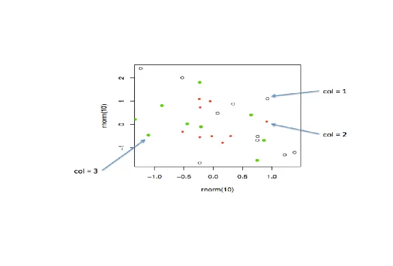
image

...

|====== | 7%
| According to the plot, what is color 2?

1: Blue
2: Empty black circles
3: Red
4: Green

Selection: 3

| Nice work!

|======= | 9%
| So these are the first 3 default values. If you were plotting and just specified
| col=c(1:3) as one of your arguments, these are colors you'd get. Maybe you like
| them, but they might not be the best choice for your application.

...

|======== | 10%
| To show you some options, here's a display of two color palettes that come with the
| grDevices package available to you. The left shows you some colors from the function
| heat.colors. Here low values are represented in red and as the values increase the
| colors move through yellow towards white. This is consistent with the physical
| properties of fire. The right display is from the function topo.colors which uses
| topographical colors ranging from blue (low values) towards brown (higher values).
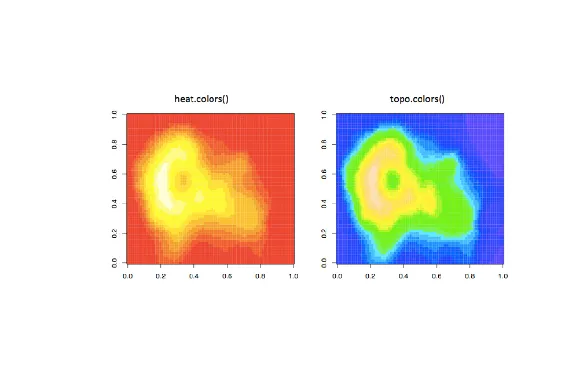
image

...

|========= | 12%
| So we'll first discuss some functions that the grDevices package offers. The
| function colors() lists the names of 657 predefined colors you can use in any
| plotting function. These names are returned as strings. Run the R command sample
| with colors() as its first argument and 10 as its second to give you an idea of the
| choices you have.

sample(colors(),10)
[1] "gray1" "darkorchid2" "blue3" "darkorchid3" "gray10"
[6] "firebrick1" "magenta3" "gray75" "lemonchiffon4" "rosybrown3"

| Great job!

|========== | 13%
| We see a lot of variety in the colors, some of which are names followed by numbers
| indicating that there are multiple forms of that particular color.

...

|=========== | 14%
| So you're free to use any of these 600+ colors listed by the colors function.
| However, two additional functions from grDevices, colorRamp and colorRampPalette,
| give you more options. Both of these take color names as arguments and use them as
| "palettes", that is, these argument colors are blended in different proportions to
| form new colors.

...

|============ | 16%
| The first, colorRamp, takes a palette of colors (the arguments) and returns a
| function that takes values between 0 and 1 as arguments. The 0 and 1 correspond to
| the extremes of the color palette. Arguments between 0 and 1 return blends of these
| extremes.

...

|============= | 17%
| Let's see what this means. Assign to the variable pal the output of a call to
| colorRamp with the single argument, c("red","blue").

pal<-colorRamp(c("red","blue"))

| You are amazing!

|=============== | 19%
| We don't see any output, but R has created the function pal which we can call with a
| single argument between 0 and 1. Call pal now with the argument 0.

pal(0)
[,1] [,2] [,3]
[1,] 255 0 0

| You are quite good my friend!

|================ | 20%
| We see a 1 by 3 array with 255 as the first entry and 0 in the other 2. This 3 long
| vector corresponds to red, green, blue (RGB) color encoding commonly used in
| televisions and monitors. In R, 24 bits are used to represent colors. Think of these
| 24 bits as 3 sets of 8 bits, each of which represents an intensity for one of the
| colors red, green, and blue.

...

|================= | 22%
| The 255 returned from the pal(0) call corresponds to the largest possible number
| represented with 8 bits, so the vector (255,0,0) contains only red (no green or
| blue), and moreover, it's the highest possible value of red.

...

|================== | 23%
| Given that you created pal with the palette containing "red" and "blue", what color
| do you think will be represented by the vector that pal(1) returns? Recall that pal
| will only take arguments between 0 and 1, so 1 is the largest argument you can pass
| it.

1: blue
2: red
3: green
4: yellow

Selection: 1

| Keep up the great work!

|=================== | 25%
| Check your answer now by calling pal with the argument 1.

pal(1)
[,1] [,2] [,3]
[1,] 0 0 255

| Excellent work!

|==================== | 26%
| You see the vector (0,0,255) which represents the highest intensity of blue. What
| vector do you think the call pal(.5) will return?

1: (0,255,0)
2: (255,255,255)
3: (127.5,0,127.5)
4: (255,0,255)

Selection: 3

| You got it!

|===================== | 28%
| The function pal can take more than one argument. It returns one 3-long (or 4-long,
| but more about this later) vector for each argument. To see this in action, call pal
| with the argument seq(0,1,len=6).

pal(seq(0,1,len=6))

     [,1] [,2] [,3]  
[1,]  255    0    0  
[2,]  204    0   51  
[3,]  153    0  102  
[4,]  102    0  153  
[5,]   51    0  204  
[6,]    0    0  255  

| Nice work!

|====================== | 29%
| Six vectors (each of length 3) are returned. The i-th vector is identical to output
| that would be returned by the call pal(i/5) for i=0,...5. We see that the i-th row
| (for i=1,...6) differs from the (i-1)-st row in the following way. Its red entry is
| 51 = 255/5 points lower and its blue entry is 51 points higher.

...

|======================= | 30%
| So pal creates colors using the palette we specified when we called colorRamp. In
| this example none of pal's outputs will ever contain green since it wasn't in our
| initial palette.

...

|========================= | 32%
| We'll turn now to colorRampPalette, a function similar to colorRamp. It also takes a
| palette of colors and returns a function. This function, however, takes integer
| arguments (instead of numbers between 0 and 1) and returns a vector of colors each
| of which is a blend of colors of the original palette.

...

|========================== | 33%
| The argument you pass to the returned function specifies the number of colors you
| want returned. Each element of the returned vector is a 24 bit number, represented
| as 6 hexadecimal characters, which range from 0 to F. This set of 6 hex characters
| represents the intensities of red, green, and blue, 2 characters for each color.

...

|=========================== | 35%
| To see this better, assign to the variable p1 the output of a call to
| colorRampPalette with the single argument, c("red","blue"). We'll compare it to our
| experiments using colorRamp.

p1<-colorRampPalette(c("red","blue"))

| You got it!

|============================ | 36%
| Now call p1 with the argument 2.

p1(2)
[1] "#FF0000" "#0000FF"

| All that hard work is paying off!

|============================= | 38%
| We see a 2-long vector is returned. The first entry FF0000 represents red. The FF is
| hexadecimal for 255, the same value returned by our call pal(0). The second entry
| 0000FF represents blue, also with intensity 255.

...

|============================== | 39%
| Now call p1 with the argument 6. Let's see if we get the same result as we did when
| we called pal with the argument seq(0,1,len=6).

p1(6)
[1] "#FF0000" "#CC0033" "#990066" "#650099" "#3200CC" "#0000FF"

| You are amazing!

|=============================== | 41%
| Now we get the 6-long vector (FF0000, CC0033, 990066, 650099, 3200CC, 0000FF). We
| see the two ends (FF0000 and 0000FF) are consistent with the colors red and blue.
| How about CC0033? Type 0xcc or 0xCC at the command line to see the decimal
| equivalent of this hex number. You must include the 0 before the x to specify that
| you're entering a hexadecimal number.

0xCC
[1] 204

| You are amazing!

|================================ | 42%
| So 0xCC equals 204 and we can easily convert hex 33 to decimal, as in
| 0x33=3*16+3=51. These were exactly the numbers we got in the second row returned
| from our call to pal(seq(0,1,len=6)). We see that 4 of the 6 numbers agree with our
| earlier call to pal. Two of the 6 differ slightly.

...

|================================= | 43%
| We can also form palettes using colors other than red, green and blue. Form a
| palette, p2, by calling colorRampPalette with the colors "red" and "yellow".
| Remember to concatenate them into a single argument.

p2<-colorRampPalette(c("red","yellow"))

| You are really on a roll!

|=================================== | 45%
| Now call p2 with the argument 2. This will show us the two extremes of the blends of
| colors we'll get.

p2(2)
[1] "#FF0000" "#FFFF00"

| Excellent work!

|==================================== | 46%
| Not surprisingly the first color we see is FF0000, which we know represents red. The
| second color returned, FFFF00, must represent yellow, a combination of full
| intensity red and full intensity green. This makes sense, since yellow falls between
| red and green on the color wheel as we see here. (We borrowed this image from
| lucaskrech.com.)
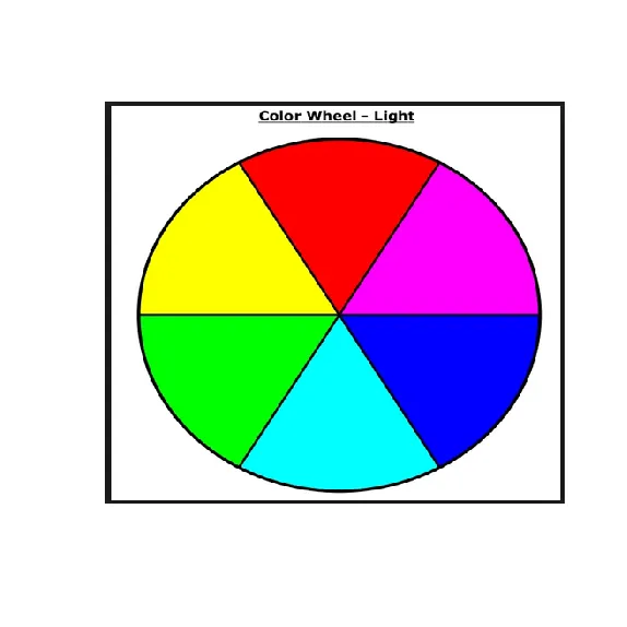
image

...

|===================================== | 48%
| Let's now call p2 with the argument 10. This will show us how the two extremes, red
| and yellow, are blended together.

p2(10)
[1] "#FF0000" "#FF1C00" "#FF3800" "#FF5500" "#FF7100" "#FF8D00" "#FFAA00" "#FFC600"
[9] "#FFE200" "#FFFF00"

| Your dedication is inspiring!

|====================================== | 49%
| So we see the 10-long vector. For each element, the red component is fixed at FF,
| and the green component grows from 00 (at the first element) to FF (at the last).

...

|======================================= | 51%
| This is all fine and dandy but you're probably wondering when you can see how all
| these colors show up in a display. We copied some code from the R documentation
| pages (color.scale if you're interested) and created a function for you, showMe.
| This takes as an argument, a color vector, which as you know, is precisely what
| calls to p1 and p2 return to you. Call showMe now with p1(20).

showMe(p1(20))
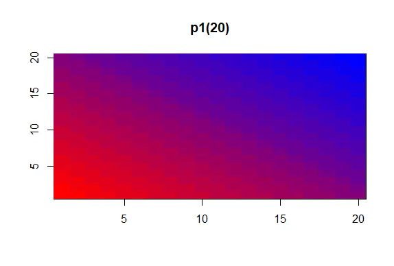
image

| That's the answer I was looking for.

|======================================== | 52%
| We see the interpolated palette here. Low values in the lower left corner are red
| and as you move to the upper right, the colors move toward blue. Now call showMe
| with p2(20) as its argument.

showMe(p2(20))
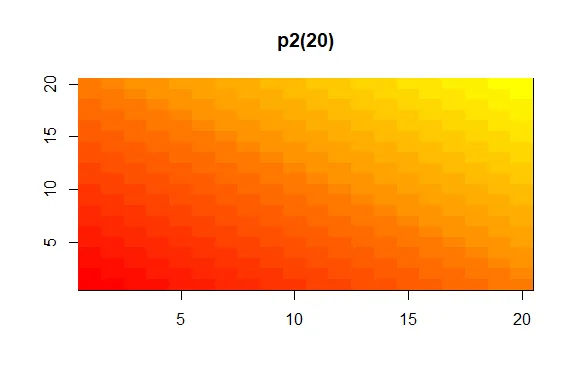
image

| You're the best!

|========================================= | 54%
| Here we see a similar display, the colors moving from red to yellow, the base colors
| of our p2 palette. For fun, see what p2(2) looks like using showMe.

showMe(p2(2))
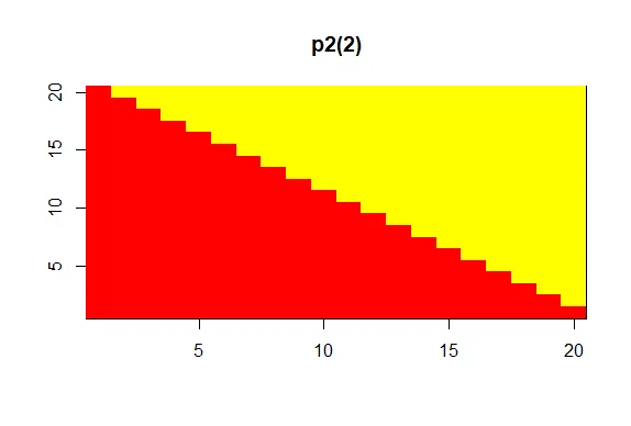
image

| You are really on a roll!

|========================================== | 55%
| A much more basic pattern, simple but elegant.

...

|============================================ | 57%
| We mentioned before that colorRamp (and colorRampPalette) could return a 3 or 4 long
| vector of colors. We saw 3-long vectors returned indicating red, green, and blue
| intensities. What would the 4th entry be?

...

|============================================= | 58%
| We'll answer this indirectly. First, look at the function p1 that colorRampPalette
| returned to you. Just type p1 at the command prompt.

p1
function (n)
{
x <- ramp(seq.int(0, 1, length.out = n))
if (ncol(x) == 4L)
rgb(x[, 1L], x[, 2L], x[, 3L], x[, 4L], maxColorValue = 255)
else rgb(x[, 1L], x[, 2L], x[, 3L], maxColorValue = 255)
}
<bytecode: 0x00000174e0c71940>
<environment: 0x00000174dbdd5a00>

| Keep up the great work!

|============================================== | 59%
| We see that p1 is a short function with one argument, n. The argument n is used as
| the length in a call to the function seq.int, itself an argument to the function
| ramp. We can infer that ramp is just going to divide the interval from 0 to 1 into n
| pieces.

...

|=============================================== | 61%
| The heart of p1 is really the call to the function rgb with either 4 or 5 arguments.
| Use the ?fun construct to look at the R documentation for rgb now.

?rgb

| You got it!

|================================================ | 62%
| We see that rgb is a color specification function that can be used to produce any
| color with red, green, blue proportions. We see the maxColorValue is 1 by default,
| so if we called rgb with values for red, green and blue, we would specify numbers at
| most 1 (assuming we didn't change the default for maxColorValue). According to the
| documentation, what is the maximum number of arguments rgb can have?

1: 6
2: 4
3: 5
4: 3

Selection: 1

| All that practice is paying off!

|================================================= | 64%
| So the fourth argument is alpha which can be a logical, i.e., either TRUE or FALSE,
| or a numerical value. Create the function p3 now by calling colorRampPalette with
| the colors blue and green (remember to concatenate them into a single argument) and
| setting the alpha argument to .5.

p3<-colorRampPalette(c("blue","green"),alpha=0.5)

| You are really on a roll!

|================================================== | 65%
| Now call p3 with the argument 5.

p3(5)
[1] "#0000FFFF" "#003FBFFF" "#007F7FFF" "#00BF3FFF" "#00FF00FF"

| Perseverance, that's the answer.

|=================================================== | 67%
| We see that in the 5-long vector that the call returned, each element has 32 bits, 4
| groups of 8 bits each. The last 8 bits represent the value of alpha. Since it was
| NOT ZERO in the call to colorRampPalette, it gets the maximum FF value. (The same
| result would happen if alpha had been set to TRUE.) When it was 0 or FALSE (as in
| previous calls to colorRampPalette) it was given the value 00 and wasn't shown. The
| leftmost 24 bits of each element are the same RGB encoding we previously saw.

...

|==================================================== | 68%
| So what is alpha? Alpha represents an opacity level, that is, how transparent should
| the colors be. We can add color transparency with the alpha parameter to calls to
| rgb. We haven't seen any examples of this yet, but we will now.

...

|====================================================== | 70%
| We generated 1000 random normal pairs for you in the variables x and y. We'll plot
| them in a scatterplot by calling plot with 4 arguments. The variables x and y are
| the first 2. The third is the print character argument pch. Set this equal to 19
| (filled circles). The final argument is col which should be set equal to a call to
| rgb. Give rgb 3 arguments, 0, .5, and .5.

plot(x,y,pch=19,col=rgb(0,0.5,0.5))
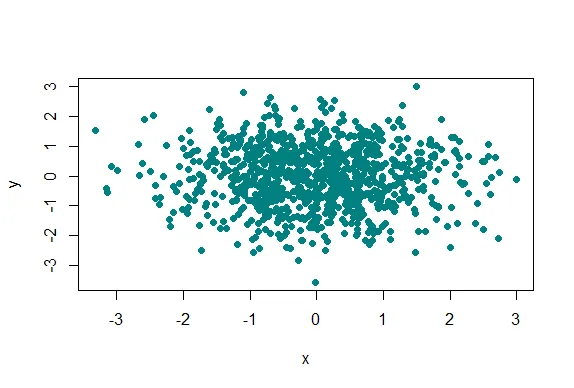
image

| Your dedication is inspiring!

|======================================================= | 71%
| Well this picture is okay for a scatterplot, a nice mix of blue and green, but it
| really doesn't tell us too much information in the center portion, since the points
| are so thick there. We see there are a lot of points, but is one area more filled
| than another? We can't really discriminate between different point densities. This
| is where the alpha argument can help us. Recall your plot command (use the up arrow)
| and add a 4th argument, .3, to the call to rgb. This will be our value for alpha.

plot(x,y,pch=19,col=rgb(0,0.5,0.5,0.3))
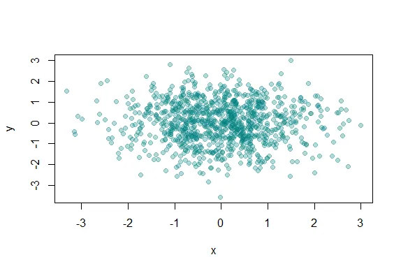
image

| You are amazing!

|======================================================== | 72%
| Clearly this is better. It shows us where, specifically, the densest areas of the
| scatterplot really are.

...

|========================================================= | 74%
| Our last topic for this lesson is the RColorBrewer Package, available on CRAN, that
| contains interesting and useful color palettes, of which there are 3 types,
| sequential, divergent, and qualitative. Which one you would choose to use depends on
| your data.

...

|========================================================== | 75%
| Here's a picture of the palettes available from this package. The top section shows
| the sequential palettes in which the colors are ordered from light to dark. The
| divergent palettes are at the bottom. Here the neutral color (white) is in the
| center, and as you move from the middle to the two ends of each palette, the colors
| increase in intensity. The middle display shows the qualitative palettes which look
| like collections of random colors. These might be used to distinguish factors in
| your data.
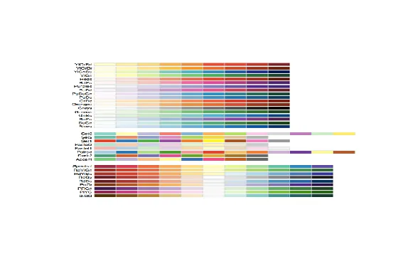
image

...

|=========================================================== | 77%
| These colorBrewer palettes can be used in conjunction with the colorRamp() and
| colorRampPalette() functions. You would use colors from a colorBrewer palette as
| your base palette,i.e., as arguments to colorRamp or colorRampPalette which would
| interpolate them to create new colors.

...

|============================================================ | 78%
| As an example of this, create a new object, cols by calling the function brewer.pal
| with 2 arguments, 3 and "BuGn". The string "BuGn" is the second last palette in the
| sequential display. The 3 tells the function how many different colors we want.

cols<-brewer.pal(3,"BuGn")

| That's the answer I was looking for.

|============================================================= | 80%
| Use showMe to look at cols now.

showMe(cols)
image

| Keep up the great work!

|============================================================== | 81%
| We see 3 colors, mixes of blue and green. Now create the variable pal by calling
| colorRampPalette with cols as its argument.

pal<-colorRampPalette(cols)

| All that hard work is paying off!

|================================================================ | 83%
| The call showMe(pal(3)) would be identical to the showMe(cols) call. So use showMe
| to look at pal(20).

showMe(pal(20))
image

| Keep up the great work!

|================================================================= | 84%
| Now we can use the colors in pal(20) to display topographic information on
| Auckland's Maunga Whau Volcano. R provides this information in a matrix called
| volcano which is included in the package datasets. Call the R function image with
| volcano as its first argument and col set equal to pal(20) as its second.

image(volcano,col=pal(20))
image

| Great job!

|================================================================== | 86%
| We see that the colors here of the sequential palette clue us in on the topography.
| The darker colors are more concentrated than the lighter ones. Just for fun, recall
| your last command calling image and instead of pal(20), use p1(20) as the second
| argument.

image(volcano,col=p1(20))
image

| Your dedication is inspiring!

|=================================================================== | 87%
| Not as nice a picture since the palette isn't as well suited to this data, but
| that's okay. It's review time!!!!

...

|==================================================================== | 88%
| True or False? Careful use of colors in plots/maps/etc. can make it easier for the
| reader to understand what points you're trying to convey.

1: False
2: True

Selection: 2

| You got it!

|===================================================================== | 90%
| Which of the following is an R package that provides color palettes for sequential,
| categorical, and diverging data?

1: RColorBluer
2: RColorBrewer
3: RColorStewer
4: RColorVintner

Selection: 2

| Keep working like that and you'll get there!

|====================================================================== | 91%
| True or False? The colorRamp and colorRampPalette functions can be used in
| conjunction with color palettes to connect data to colors.

1: False
2: True

Selection: 2

| You are really on a roll!

|======================================================================= | 93%
| True or False? Transparency can NEVER be used to clarify plots with many points

1: True
2: False

Selection: 2

| Excellent work!

|========================================================================= | 94%
| True or False? The call p7 <- colorRamp("red","blue") would work (i.e., not
| generate an error).

1: True
2: False

Selection: 2

| Excellent job!

|========================================================================== | 96%
| True or False? The function colors returns only 10 colors.

1: False
2: True

Selection: 1

| All that practice is paying off!

|=========================================================================== | 97%
| Transparency is determined by which parameter of the rgb function?

1: beta
2: gamma
3: it's all Greek to me
4: delta
5: alpha

Selection: 5

| You got it right!

|============================================================================ | 99%
| Congratulations! We hope this lesson didn't make you see red. We're green with envy
| that you blue through it.

...

|=============================================================================| 100%
| Would you like to receive credit for completing this course on Coursera.org?

1: Yes
2: No

Selection: 1
What is your email address? xxxxxx@xxxxxxxxxxxx
What is your assignment token? xXxXxxXXxXxxXXXx
Grade submission succeeded!

| Your dedication is inspiring!

| You've reached the end of this lesson! Returning to the main menu...

| Please choose a course, or type 0 to exit swirl.

1: Exploratory Data Analysis
2: Take me to the swirl course repository!

Selection: 0

| Leaving swirl now. Type swirl() to resume.

rm(list=ls())
Last updated 2020-10-02 01:15:25.561188 IST