Insights into Toronto’s Foodservice Market
Abstract
The IBM capstone project delivers valuable decision driven insights into Toronto's foodservice industry by employing modern-day data science tools. K means, an unsupervised clustering algorithm is applied to segregate the city's restaurant market into clusters based on the types of restaurants established in the city. Relationship between foodservice market of a neighbourhood and its location relative to the city centre along with relationships within various types of restaurants are analysed using inferential statistics.
Introduction/Business Understanding
Background
By 2022, quick-service restaurants are expected to remain the largest segment in the foodservice industry in Canada followed by full-service restaurants. However, Toronto’s landscape is unique compared to the rest of the country. Toronto has comparatively higher percentages of coffee shops and fine dining restaurants compared to the national average. There are also more restaurants serving European menus in Toronto than in other places, whereas the “hamburger” type menus are relatively scarce in the city. It is interesting to note that Toronto has a very strong presence of independently owned restaurants making up more than 90% of the city’s foodservice market.
Area of Interest
With a blooming foodservice market, Toronto constantly attracts new restaurants and food joints. The target audience of the project are the investors and potential restaurant owners are often faced with several market research questions such as the current market landscape in the area of interest, the type of restaurant that fits well with the neighbourhood, the best location for a particular type of restaurant, etc. However, since Toronto's foodservice market is unique to itself, new owners cannot simply rely on a nationwide analysis. A city-specific analysis is what would benefit anyone who intends to start a new restaurant in Toronto and that is precisely what this project presents.
Problem Statement
This project aims to provide valuable insights into Toronto’s current foodservice market such distribution of restaurant types by locations, variations in density of restaurants and suggestive analysis of types of restaurants to benefit new and potential restaurant owners and investors.
Analytical Approach
Clustering
The approach is to categorize types of restaurants in Toronto into various clusters and map them to their geographical locations. A visualization map of Toronto would illustrate these clusters cast across its postal codes.
Correlation
Further analysis is done to identify any correlation between restaurants in the neighbourhood and its distance from the city centre, and any significant correlations within types of restaurants.
Data Acquisition
Data requirements
The data required for the project includes the list of postal codes of the city, types of restaurants in each location, number of restaurants of each type, distances of restaurants from the city centre, and the geographical coordinates of the locations to visualize the data in a map.
Data collection
Neighbourhood data
Postal code data for Toronto is scraped from the following Wikipedia page:
Source: https://en.wikipedia.org/wiki/List_of_postal_codes_of_Canada:_M
Data points:
-
Postal code
-
Borough
-
Neighbourhood
Geographical coordinates
Geographical coordinates data is extracted using Mapquest’s Geocoding API:
Source: https://developer.mapquest.com/documentation/geocoding-api/
Alternate source (Google API dump): http://link.datascience.eu.org/p001d1
Data points:
-
Postal code
-
Latitude
-
Longitude
Foodservice market data
Restaurant data is extracted from FourSquare’s Places API. FourSquare data is classified into various categories and sub-categories. Categories are identified by the tag "Category ID". The category of interest here is Food and the category ID for food is 4d4b7105d754a06374d81259. The sub-categories of the food category are various types of restaurants located in the venue.
Source: https://developer.foursquare.com/docs/api/endpoints
Data points:
-
Postal code
-
Venue Latitude
-
Venue Longitude
-
Venue category
-
Venue subcategory
Table 1. Data points and data sources.
| Datapoint | Source |
|---|---|
| Postal Code | Wikipedia |
| Borough | Wikipedia |
| Neighbourhood | Wikipedia |
| Postal Code | MapQuest Geocoding API |
| Latitude | MapQuest Geocoding API |
| Longitude | MapQuest Geocoding API |
| Postal Code | FourSquare Places API |
| Venue Latitude | FourSquare Places API |
| Venue Longitude | FourSquare Places API |
| Venue Category | FourSquare Places API |
| Venue Subcategory | FourSquare Places API |
Scraping neighbourhood data from the web
Since the neighbourhood and postal code data is already in the form of a table, we can use the pandas read_html which looks for tabular data and loads it into a data frame
Collecting geographical coordinates from MapQuest
Documentation for MapQuest Geocoding API is available at https://geocoder.readthedocs.io/providers/MapQuest.html
Extracting types of restaurants from FourSquare
FourSquare's category ID for Food is 4d4b7105d754a06374d81259. Venues will be searched in each neighbourhood by this category ID. The restaurant type, which is the sub-category, of each venue is extracted. If there are no restaurants in a neighbourhood, then the restaurant type will be assigned as "No Restaurants".
Data Preparation and Feature Extraction
Data understanding
The geographical data from MapQuest contains variables PostalCode, Latitude and Longitude.
The FourSquare API data contains records of variables RestaurantType and PostalCode.
Data Preperation
Postal code and neighbourhood data
The extracted data contains numerous issues that were fixed. The neighbourhood data contained postal codes without any boroughs assigned which were dropped. Some neighbourhoods were not assigned a neighbourhood name, so their borough names were assigned to them. In some cases, more than one neighbourhood shared the same postal code. After fixing these issues, the data contained 103 records of postal code data.
Plotting a map of neighbourhoods with MapQuest data
The geographical coordinates data extracted from MapQuest had some concerns too. The postal code data is merged with the coordinates and plotted on a map to get a basic understanding of the data. Following image displays a map of Toronto with neighbourhood markers overlayed on it. It was observed that the MapQuest latitude and longitude were not accurate and many of the nearby neighbourhoods had the same coordinates.
So the coordinates data is replaced by the data extracted from the alternate source, a static CSV file of Google API output. The following image displays a map of Toronto with the neighbourhoods as markers. The latitude of the map is offset by 0.07 to centre the map around the neighbourhoods.
Plotting a map of neighbourhoods with the CSV data from Google API
Examining the maps above, it is evident that the coordinates data from Google API is of better quality than that of MapQuest. Hence, the MapQuest data is discarded and Google coordinates data is used.
FourSquare Restaurant data
The FourSquare API returned 1564 records of variables RestaurantType and PostalCode, of which, some locations did not have any restaurants within the specified radius. The RestaurantType variable for such locations was marked as No Restaurants.
Feature Extraction
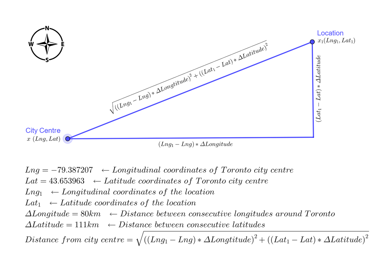
Along with the extracted features such as PostalCode, Neighbourhood, Latitude, Longitude and RestaurantType, a new variable for the distance of the location from the city centre is added as Distance.
The Distance of a location x1 from the city centre x is calculated using the famous Pythagoras theorem. However, latitudes and longitudes do not follow the same scale throughout the globe. The distance between any two consecutive latitudes is 111 kilometres, but the distance between two consecutive longitudes varies depending on where on Earth we are measuring it. The distance between two longitudes at the Equator is 111 kilometres but it gradually keeps reducing as we move away from the Equator and toward the poles. The information at the National Oceanic and Atmospheric Administration website is used to calculate the approximate distance between two consecutive longitudes in Toronto to be 80 kilometres. The following image illustrates the calculation of the distance of a location from Toronto city centre.
Following are the extracted and calculated features of the data frame df_Data used in the analysis.
| Feature | Source | Description | Purpose |
|---|---|---|---|
| PostalCode | Extracted from Wikipedia | A three-letter alphanumeric postcode of a neighbourhood in Toronto | Primary key to merge various data frames. |
| Neighbourhood | Extracted from Wikipedia | One or more neighbourhood names that fall within the area of the postcode. | A key variable around which the analysis is done. Also used as markers on the map. |
| Latitude | Extracted from MapQuest or Google API | Latitude of the postcode in decimal units. | To locate neighbourhoods on the map and to calculate the distance of a location from the city centre. |
| Longitude | Extracted from MapQuest or Google API | Longitude of the postcode in decimal units. | To locate neighbourhoods on the map and to calculate the distance of a location from the city centre. |
| Distance | Calculated | Distance of a location from the city centre in kilometres. | To calculate the correlation between the distance of a location from the city centre and the number of restaurants in the location. |
| RestaurantType | Extracted from FourSquare API | Type of a restaurant. | To partition the city of Toronto into various clusters based on restaurant types located in the city. Also used to find possible correlations between various restaurant types within the city. |
Exploratory Data Analysis - Clustering Toronto neighbourhoods by restaurant types
K-Means Clustering
Clustering or cluster analysis is the process of dividing data into groups (clusters) in such a way that objects in the same cluster are more similar to each other than those in other clusters. The goal is to divide Toronto neighbourhoods into various groups based on the top 10 types of restaurants located in the neighbourhoods. There are various models and techniques for cluster analysis. K-means clustering is a simple unsupervised learning algorithm that is commonly used for market segmentation. The RestaurantType column is first one-hot encoded and grouped by PostalCode.
Following are the top 10 types of restaurants in Toronto
Determining the optimal k

The optimal value of the number of clusters, k, is determined using the elbow method to be 3.
The neighbourhoods are grouped into three clusters. The following table shows the cluster number and the number of neighbourhoods in each cluster.
Visualization
The image is a visualization of neighbourhood clusters displayed on a map of Toronto. Each cluster is marked by a different colour to easily distinguish it from other clusters. The map enables viewers to visualize the locations of the city fall into various segregations based on their types of restaurants.
Market insights
Examining each cluster individually and then by comparing it with other clusters provides valuable insights into Toronto's foodservice market.
The red cluster has 11 neighbourhoods that are located closest to the city centre. With 50 restaurants per neighbourhood, it has the highest density of restaurants in the city. Besides having the highest number of coffee shops, it also has a high number of restaurants followed by food courts and fast food centres. It is also interesting to note that all neighbourhoods in this group have restaurants. This cluster is a thriving market for foodservice industry but start-ups may also face stiff competition.
The green cluster consists of 79 neighbourhoods. This group has the lowest concentration of 8 restaurants per neighbourhood. It's top food services are coffee shops, café, fast food restaurants and pizza places. The number of restaurants of each type is more or less proportional, unlike the red cluster where the coffee shops were about three times more than any other restaurant type. It is important to note that 25% of these neighbourhoods have no restaurants at all. This is a great opportunity for new start-ups to perform further market research. This cluster is also spread out uniformly throughout the city. With moderate competition and a variety of restaurant types, the neighbourhoods in this cluster might be a good choice to start up a new restaurant, especially if it is from the top restaurant categories of this cluster.
The blue cluster consists of 13 neighbourhoods with a high average concentration of 44 restaurants per neighbourhood. All neighbourhoods have restaurants. This cluster has the most proportionally distributed types of restaurants of all. Though coffee shops dominate the market, there are a good number of pizza places, cafés, Italian and other restaurants. These neighbourhoods are possibly one of the promising locations to start a new pizza place or an Italian restaurant.
Inferential Data Analysis
The following image illustrates any possible correlations between data variables.

Key observations:
- The red markers indicate the possibility of a negative correlation between Distance and number of restaurants.
- Possible positive correlations between a few restaurant types
Relationship between the location of the neighbourhood and the number of restaurants in it.
A correlation coefficient of -0.63 indicates a moderately strong negative correlation between the distance of a neighbourhood from the city centre and the number of restaurants located in the neighbourhood. A negligible p-value of 1.09e-12 implies the correlation is statistically significant. The following chart graphically represents the relationship between the two variables. This implies that the foodservice market in Toronto is highly concentrated around the city centre and becomes sparser as we move farther. It can be speculated that the restaurant market is driven by large demand and strong competition at the centre of the city and their demand dampens toward the city limits, however, additional research is required to reach to such conclusions.

Relationships between types of restaurants
Correlations
As observed in the correlation heatmap earlier (in Fig 06), there was some positive correlation in blue among most restaurant types. Since we are interested in moderate to strong correlations, we can ignore restaurants with mild or no correlations to reduce the clutter. Following is a visualization of restaurant types with correlation coefficients greater than 0.7.

Also, some restaurant pairs hold strong correlations but the number of such restaurants is so small that their correlations are practically insignificant. In this case, we are interested in correlations between restaurants that have at least five restaurants of their type in the city. Any restaurant type with less than 5 restaurants is dropped from further analysis.
Regression coefficients (Pearson r) and p-values are calculated from Pearsons regression. Only coefficients greater than 0.7 are considered. For a 99% confidence study, we take in to account only the restaurant pairs with p less than an α of 0.01.
Following is the list of features and correlation heatmap of restaurant types r > 0.7 and p < 0.01.

Regression Analysis

The above figure illustrates eight pairs of restaurant types with a strong positive correlation between each other. All the pairs have p-values much lesser than an α of 0.01 indicating high statistical significance. For example, in chart 1, neighbourhoods with a high number of Food Court restaurants also have a relatively high number of Deli / Bodega restaurants. So if someone plans to open a deli in Toronto, it may be a good idea to choose a location with a good number of food courts. Similarly, in chart 2, it may be profitable to open a coffee shop in a location with restaurants. Similar inferences can be made with all the pairs of restaurants from the charts above.
Conclusions
In this study, cluster analysis and correlation/regression analysis are used to explore valuable insights into Toronto foodservice market. The city is divided into several clusters based on types of restaurants to give a bird's eye view of market trends. The inverse relationship between the number of restaurants in a location and the distance of the location from the city centre indicate that the restaurant industry flourishes when it's closer to the centre. Strong positive correlations between pairs of restaurants help investors to decide better on profitable locations for their new ventures.
Future directions
The study analyzes the restaurant market based on the number of restaurants in the location. The analysis can be greatly enhanced by taking profitability into account. This project could be further improved by adding factors such as demand, competition, population, etc into consideration.
Project links
Download/view project report: [PDF]
View project output with code: [Blog post], [nbviewer], [Github]
References
[1] “Foodservice Industry Forecast 2018-2022,” Restaurants Canada (formerly CRFA). https://www.restaurantscanada.org/resources/foodservice-industry-forecast/
[2] “The Canadian Restaurant Industry Landscape – why is Toronto Unique?” CHD Expert. https://www.chd-expert.com/blog/press_release/the-canadian-restaurant-industry-landscape-why-is-toronto-unique/
[3] “Pythagorean theorem,” Wikipedia. https://en.wikipedia.org/wiki/Pythagorean_theorem
[4] “Latitude/Longitude Distance Calculator,” National Oceanic and Atmospheric Administration - National Hurricane Center and Central Pacific Hurricane Center. https://www.nhc.noaa.gov/gccalc.shtml
[5] “Determining the number of clusters in a data set,” Wikipedia. https://en.wikipedia.org/wiki/Determining_the_number_of_clusters_in_a_data_set#The_elbow_method
[6] “Pearson Correlation and Linear Regression,” University of Texas - Austin. http://sites.utexas.edu/sos/guided/inferential/numeric/bivariate/cor/
[7] “Simple Linear Regression and Correlation,” StatsDirect Limited. https://www.statsdirect.com/help/regression_and_correlation/simple_linear.htm
Comments